1.
Which practical skills and methodologies have you developed
within this module and how effectively do you think you are
employing them within your own practice?
|
Although I have used gouache before I feel like I'm really getting the hang of it now. I invested in some new gouache from the library which works much better than my old ones and has been really fun to use. I am finally getting better with consistency and creating flat, block colours with it.
During the One Week Book brief I did some screen printing and since we were in a group it went a lot smoother than it ever has before. My ink pulling technique has definitely improved and I am excited to be able to do more screen printing. I am much more confident about it now than I was last year although we have only done one session.
For my picture book I used Photoshop to edit my images which included piecing together several scans to make one image. This was an new experience and most of it went smoothly but I did have to expand my editing skills when things didn't line up properly. The heal tool is a god-send and before the Photoshop inductions I never used it but I have found it very useful in this project. I have not used Photoshop much in these projects but the small bits of editing I have done have been successful.
Using In Design is another skill I have developed, I have previously used In Design but I find that things are much clearer now and I'm not as lost doing things in it. I have learned the importance of bleed as in my final picture book I did not factor in a bleed and ended up slicing a little too much off my book. Bleed is important.
Not sure if this is strictly a skill but I have been doing a lot of folding due to the fact that I chose to do a concertina book. Using a bone folder was new for me but really improved the quality of my folding (although my book still ended up wonky)
|
2.
Which approaches to research have you found most valuable during
this module. How have you interrogated your research to identify
appropriate ideas?
Doing primary research was really valuable to all the briefs in this project and has been a lot more exciting than it has been in previous years (A-Level, GCSE etc) probably because the course is more self driven. Being able to go off and explore places individually was great. Primary research was great for being able to draw from life and actually experience something and have an emotional response from the place.
Secondary research has been valuable too for extra bits of information - as I researched woodlands I actually went to a few woods but I also did research via the internet on wildlife, reference images of trees and various other things that didn't actually end up being relevant - a danger of the secondary information.
|
I wrote down literally every idea that came into my head and tried to weed out the good ideas from the bad. Sometimes this involved further secondary research like when I thought I could do something related to paganism but then realised that I was pushing out a little too far for my time scale and brief. Other times I would just sketch out the idea as having a visual helps me to decide how well this might turn out.
|
3.
What strengths can you identify within your submission and how
have you capitalised on these?
During the Visual Journalist / Picture Book briefs I did a lot of visual research and media testing. My image making really drove my book forward. I I really did an exhaustive amount of research for this project - much more than I have ever done in other projects. I feel as if I've gone through a really explorative journey with many twists and turns in the road, it's been exciting.
I feel like my roughs are much clearer than they have been previously as I have done several different plans for the book and annotated a lot of them for future reference.
|
I am very pleased with my overall final book I think a strength of mine was that I put a lot of work into this. My gouache skills have improved vastly and the image quality and colour scheme is probably some of the best elements of my work.
|
4.
What areas for further development can you identify within your
submission and how will you address these in the future?
|
I think my crafting is better in this project but it could still be improved. I definitely need to take more time to refine my work and get things crafted more precisely. Especially folding if I am going to be making more books. I think to improve further on my crafting I should be practising all the time within my degree and also for a hobby as practice makes perfect.
Time management is definitely another thing I need to improve - I have talked further about this in point 6. I will be using a diary and trying to plan my days so I can get the most out of them.
Based on the One Week Book brief I would like to develop my ability to work collaboratively, as sometimes I can be a little shy and not used to working in groups (although I may appear deceivingly social). I worked well in my group during that brief - it all went well but I feel as if this is something I do need to improve on.
|
5.
How effectively are you making decisions about the development of
your work?
What
informs these decisions? What problems have you identified and how
have you solved them?
Some of my decisions have been based on time constraints like if I needed to get something done quickly then I would just have to make a decision without lingering too long on it. I find that a lot of my decisions are based on feedback from other people, I will weigh up my options and then ask for others' opinions which feed into my final decision as well as feedback from crits. I found this helpful because I was able to get a few people's opinion on my work before coming to a final decision myself.
My project took a massive turn from my project proposal as I was intending to focus my book on a contrast between trash in British woodlands and tropical animals kept in man made environments. Part of my decision to change my idea back to just woodlands was the fact that when I tried to explain my idea I couldn't do it very well - people didn't quite understand it and it felt as if I couldn't actually connect with my project. This kind of decision came from some feedback but also just from a gut feeling and I changed it at a point that I had enough time to backtrack my project.
One of the big decisions in my book was deciding on a media to use. For this decision I had to do a lot of experiments with different media and weighed up the pros and cons of the media/technique. In the end I went for the one that looked best for me, and other's agreed.
I had wanted my book to be double sided but was told I couldn't do double sided if the page was over A2 which I thought it would be (but it ended up being printed on a smaller stock so I could have actually done it double sided). Because of this I had to change the direction my book folded - so the end pages pointed outward - allowing artwork to me on the front and back of the book. Due to the lack of double sided, I also made a 'belly band' for my book to act as a front cover.
6.
How effectively have you managed this project and organised yourself
during this module?
I have managed my time in this project better than I have for other projects though I still think I could improve a lot more. I have started using a diary and lots of to do lists that I keep with me - my main problem is sticking to those plans and getting stuff done on time. The best time managing I did was when my digital print induction was on Tuesday afternoon and I was seeing Slipknot that evening, so I managed my time to be able to print off my final book for Tuesday so I could enjoy the concert to the max. Perhaps this is not the most efficient way of planning but it really motivated me. I think I will have to motivate myself with rewards or events so I can manage my time around them. I am going to continue using my diary as it has definitely improved how I work.
Setting aside time for blogging is something I need to work on to as I often have to back-track my project or I leave stuff in drafts for weeks. In future projects I will strive to blog more regularly.
|
Sunday 25 January 2015
Visual Narratives OUIL405 Self Evaluation.
Saturday 24 January 2015
Visual Narratives: Final Piece - Printing and Finishing // Evaluation
Folding a concertina book is absolutely nerve wracking. I trimmed the sides off my images but one ended up being about half a millimetre shorter than the other one - I was a little worried about this incase it threw all the pages off but I couldn't afford to slice any more information off the other page.
Although I was really careful with my folding it still ended up being a little off! You can't tell when it's stretched out but when it is folded you can see the pages are a little wonky. I think I should have practiced folding on spare paper a bit more so I could have got it perfect but overall I am pleased with my final outcome.


Evaluation


I am really pleased with how my final book came out. I painted my final pieces on a textured paper so the original texture has come through on the digital print. I really love the effect that gives. It's quite subtle but I think it adds a bit of extra depth to the images. I had wanted to do the colour shift that Kristyna suggested but ended up having the end of the book mostly saturated with ghosts instead, which has given a similar impression as the blue contrasts to heavily with the browns and oranges of the rest of the book. The blue colour works really well on the 'belly band' cover as it foreshadows the ending and contrasts against the trees that it sits on top of. Initially the writing on it was orange but I found that the colour burn tool made the overlapped bits orange so I thought this was a subtler way of including the colour.
Feedback
All the feedback I got on the colour was very positive as I had really considered the palette I used for this piece. I am happy that a lot of people wrote really positive things as it was stuff I was really happy with too. "Love the format to reference the trees. Love it.", "choice of format suits the content", "images work really well in concertina" - I'm glad that the intent of my format was clear - making it long and thin to reflect the height of the trees. One piece of feedback said the stock was too thick and the folding "ruined" my illustration, there are indeed some creases on the folds of my work that I'm not too pleased about but they are barely noticeable and the thickness of the stock helps it to stand up by itself so I think it's alright.Thursday 22 January 2015
Visual Narratives : Final Piece Image Making and Editing
I decided on a concertina book for my final piece - the width of this format would lend itself to a panoramic woodland view. I was unsure about how to go about making the images as I wanted to do one long image. The options I had was to paint it all out on one big piece of paper, or do it on separate pages - perhaps A4 sized. In the end I went with using two pieces of A2 to paint my images on (as this was the largest watercolour paper the library offered).


The images I made had to be double the size of the final book so that detail could be added and the images shrunk later on. I enjoyed being able to add the detail but I think I may have got too caught up in it at times and had to remind myself that everything would be half the size!
In my development I used gouache and it was my favourite result so I decided to use this for my final images, as it offered a range of colours - being mixable and I could achieve great flat colours which would help to give a stylised look to my images. Although it worked really well for my pieces I found it a little frustrating trying to mix the same colours over and over, as I couldn't really mix a large quantity at once. I also struggled a little on getting the right consistency, which left areas patchy (I went over them again) but the more I use gouache the better I'm getting to grips with it.


Since my images were so long scanning was difficult as the scanner I used closed over the side rather than over the top. I should have used the print dungeon's A2 scanner to avoid this but I was too impatient and wanted to have my files ready!
Piecing most of the scans together in photoshop was fairly easy - most of them lined up without much editing. The bandstand however was really off because I had painted it over two separate pages and obviously not drawn them properly lined up - it would have been a better plan to draw this piece as one page.


The images I made had to be double the size of the final book so that detail could be added and the images shrunk later on. I enjoyed being able to add the detail but I think I may have got too caught up in it at times and had to remind myself that everything would be half the size!
In my development I used gouache and it was my favourite result so I decided to use this for my final images, as it offered a range of colours - being mixable and I could achieve great flat colours which would help to give a stylised look to my images. Although it worked really well for my pieces I found it a little frustrating trying to mix the same colours over and over, as I couldn't really mix a large quantity at once. I also struggled a little on getting the right consistency, which left areas patchy (I went over them again) but the more I use gouache the better I'm getting to grips with it.
Since my images were so long scanning was difficult as the scanner I used closed over the side rather than over the top. I should have used the print dungeon's A2 scanner to avoid this but I was too impatient and wanted to have my files ready!
Piecing most of the scans together in photoshop was fairly easy - most of them lined up without much editing. The bandstand however was really off because I had painted it over two separate pages and obviously not drawn them properly lined up - it would have been a better plan to draw this piece as one page.
Using Molly's advice I managed to just about fix it by lining up the top of the bandstand - erasing some of the barrier and rebuilding it by copying and pasting other areas of the image, and using the heal tool to blend the areas together. I am happy that I was able to fix it up but I definitely think the image could have been better to begin with (and drawn as one image).
Saturday 10 January 2015
Visual Narratives - Development

I had wanted to do my book this way round so that the end pages folded inwards like standard book pages but when I went to digital print I found you cannot print double sided on A2 or above - which I would have to print my book off on. By flipping the book so the pages face the opposite way I am able to still have imagery on the end pages but it will not 'open' like a book. However I think it's best there are images on the front and back cover.
I thought about having separate covers stuck onto it but I'm not too confident with gluing something that finely onto it.


I did these small paintings to see how a blue ghostly figure would look ontop of brown trees. It turned out well! Though I realise I will have to do my final images much bigger and then scale them down.
I really love the look of the trees, I think they are the most successful - slightly stylised representation. This would translate well into my final book.


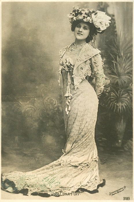
Studies of Edwardian fashion and brief sketches to get my head around things. This idea is shaping up.
 Initial idea roughs showing how this may be laid out. I thought the bandstand might look good in the middle of the book so both ends lead to it but Kristyna suggested that it would be better to have it at the end so the book doesn't climax in the middle and then flop.
I thought about starting the journey in the top corner and bringing it down to the bottom - like the actual layout of Woodhouse Ridge however since I wanted the book long and thin to emphasize the trees it was suggested that I keep a solid horizon even in a rough I think this looks way better.
Friday 9 January 2015
Visual Narratives - Kristyna Crit II
Got the final idea for my book ready - a panoramic woodland scene leading you to Woodhouse Ridge's bandstand where there will be ghostly figures enjoying themselves. As this is what they did back in the day - I think it would be interesting to give a reflection of the past.


- Think about layout. Do roughs of the pages - think about working in double page spreads (my book width will be half an a5 piece of paper so double page spreads would make sense rather that trying to cram lots of information into one tiny page)
- Base parts of the book on the actual place - I am including the bandstand from the real place but also intend to include another couple of things I noticed there such as a creepy circle of trees, and various people.
- Colour shift throughout the book - starting with greens and oranges and browns and then shifting to more unnatural tones of blue and purple for the ghostly scenes. I really like this idea as I was going to do the ghosts in blue anyway so adding a more definitive colour shift might be interesting.
- It was also suggested I do a pattern across the back of the book with Edwardian and woodland ephemera which also shifts in colour along the back of the book. (I think this idea is good too because I didn't want the back of the book to be just blank)
- Research Edwardian Fashions. (so my ghosts can be somewhat historically accurate.
Visual Narratives - Drawing from Adventures
During my trip to Woodhouse Ridge I tried to document some things I saw & did through drawings.


Different ways of drawing trees. I love the autumnal colours of the first one and how the downward strokes of the tree trunks contrast against the horizontal strokes adding bits of detail. I think the depth in this image is pretty good. Not sure about the acrylic paint though due to the kind of shiny finish it's given.
The second image was an experiment with texture, using a cut up paper plate and printing lines to make fur trees. In theory this worked but in practice not so much. It just looks like a mess. Can I refine this a bit?
I really like the format of the third page it really accentuates the height of the tree.


Trees are hard to draw
Singing alone in the woods is very therapeutic
cyclists think people alone singing in the woods are weird.


Different ways of drawing trees. I love the autumnal colours of the first one and how the downward strokes of the tree trunks contrast against the horizontal strokes adding bits of detail. I think the depth in this image is pretty good. Not sure about the acrylic paint though due to the kind of shiny finish it's given.
The second image was an experiment with texture, using a cut up paper plate and printing lines to make fur trees. In theory this worked but in practice not so much. It just looks like a mess. Can I refine this a bit?
I really like the format of the third page it really accentuates the height of the tree.
More tree texture experiments.
first one really didn't work. I tried to create a tree scape by putting down strips of masking tape and painting over them but when they peeled up they took up half of the page too. Never again.
The second image looked better before I added too much to it and it just turned into a green/turquoise rectangle covered in lines! do not overdo things! I do quite like the rough bark-like texture it gives.
The third image I like the best as its the most illustrative, I like how the trees are stylised but still recognisable as trees (remember what I said about not overdoing it) and the small person at the bottom really plays to the size of the trees.
Thursday 8 January 2015
Visual Narratives. Some More Research - Some Relevant some not, I just got a sidetracked
This is just a research and reference dump for my personal use, please excuse how disorderly it is.
WRAG
http://www.woodhouseridge.org.uk/
Woodland conservation
https://www.woodlandtrust.org.uk/our-story/
https://www.woodlandtrust.org.uk/blogs/wildlife-and-nature/senses-in-winter/
"Our vision is a UK rich in woods and trees, enjoyed and valued by everyone.
http://www.independent.co.uk/news/uk/home-news/is-this-the-bella-in-the-wych-elm-unravelling-the-mystery-of-the-skull-found-in-a-tree-trunk-8546497.html
http://www.mysteriousbritain.co.uk/england/hereford-and-worcestershire/other-mysteries/who-put-bella-in-the-wych-elm.html
Oh man this is creepy as hell! After reading this Olivia said I should put a skull in one of the tree's but I want to keep this as not scary as possible!
Paganism
Since Paganism is somewhat about worshipping nature I thought this could somehow be incorporated into my woodland book. I tried to find if any ceremonies were hosted specifically in woodlands, I do not recall finding anything specific. Leeds has a pretty large group of Pagan's in it though. I feel like I could use this for a future project.
Reference:
http://www.badwitch.co.uk/2012/06/pagan-eye-path-through-ancient.html
http://www.bbc.co.uk/religion/0/20693321
http://www.yorkshirepost.co.uk/news/features/it-s-a-moot-point-but-paganism-may-be-the-fastest-growing-religion-in-britain-1-6199786
http://www.thewhitegoddess.co.uk/the_wheel_of_the_year/
The Bandstand at Woodhouse Ridge was used as a social gathering place in Edwardian times - I found this a very interesting fact given that now all that's left of the bandstand is the concrete floor.
Reference pictures for Edwardian Outfits.
WRAG
http://www.woodhouseridge.org.uk/
Woodland conservation
https://www.woodlandtrust.org.uk/our-story/
https://www.woodlandtrust.org.uk/blogs/wildlife-and-nature/senses-in-winter/
"Our vision is a UK rich in woods and trees, enjoyed and valued by everyone.
We aim to create new native woodland with the help of communities, schools, organisations and individuals. We try to protect our precious ancient woods, restore the ones that are damaged and fight for those under threat. We do this by inspiring people up and down the country to visit woods, plant trees, and enjoy the many benefits that woodland has to offer."
Who Put Bella in the Wych Elm?http://www.independent.co.uk/news/uk/home-news/is-this-the-bella-in-the-wych-elm-unravelling-the-mystery-of-the-skull-found-in-a-tree-trunk-8546497.html
http://www.mysteriousbritain.co.uk/england/hereford-and-worcestershire/other-mysteries/who-put-bella-in-the-wych-elm.html
Oh man this is creepy as hell! After reading this Olivia said I should put a skull in one of the tree's but I want to keep this as not scary as possible!
Paganism
Since Paganism is somewhat about worshipping nature I thought this could somehow be incorporated into my woodland book. I tried to find if any ceremonies were hosted specifically in woodlands, I do not recall finding anything specific. Leeds has a pretty large group of Pagan's in it though. I feel like I could use this for a future project.
Reference:
http://www.badwitch.co.uk/2012/06/pagan-eye-path-through-ancient.html
http://www.bbc.co.uk/religion/0/20693321
http://www.yorkshirepost.co.uk/news/features/it-s-a-moot-point-but-paganism-may-be-the-fastest-growing-religion-in-britain-1-6199786
http://www.thewhitegoddess.co.uk/the_wheel_of_the_year/
The Bandstand at Woodhouse Ridge was used as a social gathering place in Edwardian times - I found this a very interesting fact given that now all that's left of the bandstand is the concrete floor.
Reference pictures for Edwardian Outfits.
 |
| Woodhouse Ridge - back in the day. |
 |
Monday 5 January 2015
Visual Narratives: Visual Journalist / Picture Book : Idea rehash.
I thought that combining both tropical world and the woods was a good idea but now I'm feeling like just focusing on the woods would give me a better result as I can focus my efforts on one subject.
I don't want to give the impression that I'm copping out of thinking about the meaning of my book, as my thoughts of revising the idea have come from the fact that I don't feel strongly enough about the animals in captivity side of the book to make it really great. However I do have a strong feeling about littering especially in beautiful places of nature so I think that I would be able to create something more successful from this.
One thing I would like to do is find some time to do a little more research - I have been to two woods already but I think it would definitely be beneficial to do a little more exploring and some secondary research on British woodlands and wildlife.
This change may set me back a bit but I'm just going to try and work as hard and fast as I can with this re-formation of stuff. I'm sure I will be able to get everything done in time.
On Wednesday I will venture out into the woods again for more research. I am definitely more comfortable with this theme - maybe I should be pushing outisde my comfort zone but I think for now keeping it "simple" would be a better choice and will increase the quality of my work.
Visual Narratives - Ideas & Drawings
I was struggling with ideas for my book so I just drew some animals that I wanted to include. (Mainly bats)


These drawings showed how I wanted to lay out the book. Having opposing pages with matching compositions - one showing the animal one showing the trash - the natural thing being in colour in both images to highlight it.
It was pretty hard to make the man made environment look man made. The only way I could think of was if I added food dishes etc.
It was suggested that adding some text to the images would clarify the intentions of my images. Perhaps a caption saying what the item is, where it's originally from and where its found. e.g: "Burmese python, originally from _____, found at tropical world", or perhaps some kind of poem. I'm not very good at writing so I'm not sure about that but captions might work.
I thought about comparisons between natural tropical animals and trash left out in the woodlands. I thought I would focus my book around the man made interacting with the natural - natural tropical animals in man made environments and man made objects (trash) within the natural woodlands.
It was pretty hard to make the man made environment look man made. The only way I could think of was if I added food dishes etc.


It was suggested that adding some text to the images would clarify the intentions of my images. Perhaps a caption saying what the item is, where it's originally from and where its found. e.g: "Burmese python, originally from _____, found at tropical world", or perhaps some kind of poem. I'm not very good at writing so I'm not sure about that but captions might work.
Subscribe to:
Posts (Atom)