Tuesday 15 December 2015

About the Author: Making that final thing Part 1. PREPARATION.


My photoshop layout file so far - I will be adding little "descriptions" of the beers underneath the labels but so far I am happy with it. It's a weight off my shoulders to see it all laid out. Obviously I will be creating positives from this - I am really looking forward to printing this even though I am very afraid lots of things will go very wrong.

I'm not sure whether to print the back of the book as well, as I am afraid of how it will line up - and time consumption. I feel like if I am going to print the back I should do the front first - as thats the more important side.

I think when I go to print my positivies, as the size of the overall book will be equivalent to an a2 piece of paper cut in half, I will print the images togther on A2. Like this:

About the Author: Photoshop smashing

Here I am creating the backgrounds of the labels, using photoshop so they will all be smooth as I doubted my abilities cutting these shapes from lino. So far I think this is going well I have been able to make some pieces I am really happy with - and digitally being able to fiddle with the colours really helps in making decisions. 

Some of the images that worked well when I painted them I realised would probably not translate well into prints - such as the heart. I wanted to do the heart pale but when I was changing things around in photoshop and thinking about it I realised it would be a better idea to do it black - as then all of the main imagery would be bold and black and the backgrounds would be the green colour. 

When adding text I struggled warping it so it would fit into the space - but as I had other images to sort out I decided to revisit that later, I don't know how I'm going to do it but I'm sure I will figure out a way. 

In my original lino prints I really liked how the green ink showed through the black on the 'Black Cat' print, in photoshop I experimented with levels and opacity to see how it would look. I think this will be achieveable using screenprint, as when I did my screenprint workshop the blue/turquoise colour of the raven showed through the black. Maybe the black could be not true black, but a dark grey.

Thursday 10 December 2015

About The Author: Artist! - Johnny Hannah


I think the tone of Hannah's work is really interesting. There's lots of stuff going on, and this above has a particularly dark, spooky, gothic feel about it. Which is appropriate in relation to my own work on this project. I love the build up of layers in these images it makes them really exciting to look at as I can keep looking and see more and more!
The fact that you can see that traditional processes have been used (in some part anyway) to create this pieces gives them a niche personal touch - as opposed to something that could be designed similarly but all done digitally. I think the handcrafted vibe is a good thing going on here.
The style also looks kind of vintage- styled to a degree. Not overly twee or commercialised vintage-isms but more of an influence that is there but not overpoweringly so.

I love the look of this bottle motif. I could imagine as a pattern print on anything really. The whole label / bottle design is pretty relevant to the themes of my publication and it's interesting to see how other artists have approached this.
I am thinking of doing a pattern of bottles, but not in this same way. Though this does look really cool and would make an awesome back for a book!

Monday 7 December 2015

About the Author: Some Ideas Development

 This lino print I did in a workshop and hadn't planned out but just did spontaneously, I mentioned before I wanted this to sort of suggest the shape of lungs - as many women in Poe's life died of tuberculosis. In a crit this didn't come across without explanation, it was either interpreted as a tree or cracks. But the cracks got me thinking about "The Fall of the House of Usher" where in the end the house physically cracks.
Taking influence from my original lino print I did this painting, joining the "infected lung" branches into the crack down the house. I love how this painting turned out, I think the colours work really well - and very much influenced by choice to continue with this colour scheme.

For my final prints I decided to translate a similar image to lino! However I do not think that this came out as well as I would have liked it to, definitely one of the weaker designs - but I'm not sure I had the time to try and re-do it when I had 6 other designs to do! I think this could have been improved just by tweaking the shape of the house so it would be less square and more like the painting. Though I do like the reversal of the house and the girl, (as in fall of the house of usher the female character is put while still alive in the tomb under the house). So it's a sneaky link back to the story. 

About the Aurthor: Lino Prints

I will be making a concertina book that is (hopefully) screenprinted, to make the images for my screenprint I have made lino cuts of some components. A greatly long winded process of making prints in the end but I am hoping the amount of effort put in will translate into an obviously hand crafted end result.


I'm really enjoying a lot of the textures that are coming out of lino print and hope that I can transfer them into my screen-print positives too. I think the lino prints have a quality about them that resonates with Poe's work. As standalone pieces these aren't so great but as components to a bigger picture I think these are successful. 

I really like how the two colour black cat one came out, this was initially just a test but I thought if it came out well enough I could use it and save time on remaking pieces. The bricks are kind of messy but I really liken how the green ink still shows through the black - it suggests the story of the cat being bricked into the wall. 

Wednesday 2 December 2015

About the Author: Sting Sound / Music

This improvised piano piece by Lennie Tristano is based on Poe's writing "Descent into the Maelstrom". The tone of the tune I think quite suits Poe's work, I think it suggests madness with the high pitched fast played notes and clashing sounds. Using a 15 second sample from this may be good for the sting, or part of it. I think the sounds of the notes can be found similar to the clinking of glass bottles (bottles will be a prominent feature in the sting), so I think if used right it could work well.

Tuesday 1 December 2015

About the Author: Project Proposals


Project Proposal: Production and Presentation of my Moving Pictures


I intend to produce:
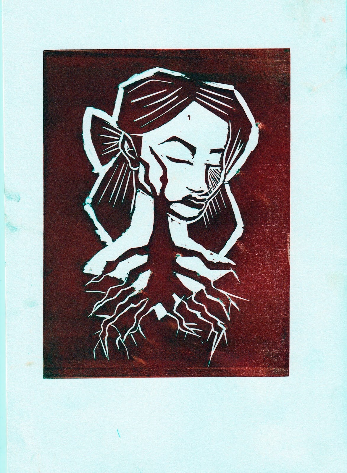
 A 15 second sting based on the life and works of Edgar Allan Poe. It will be created using After Effects and contain sound, be two colours, and contain some element of the print-work that will go alongside it. 


 The content will focus mostly on (identify 3 specific themes, texts or concepts):
 - Mostly on Edgar Allan Poe's life more than his work
- Somewhat based on his alcoholism
- Mystery, a main aspect about Poe's work & concerning his death, I think the imagery and feel should be mysterious


I will be aiming to communicate (specific themes and messages):
- A dark, gloomy, gothic atmosphere
- facts about Edgar Allan Poe (his alcoholism)
- Mystery (again) 
 
To an Audience of (Three characteristics): 
- Fans of Edgar Allan Poe
- Gothic Types
- Internet dwellers (as that is where the sting will be featured)


Project Proposal: Production and Presentation of my Printed Pictures


I intend to produce:
A two colour screenprinted publication, probably a concertina book, based on the works of Edgar Allan Poe. Turning Poe's stories and Poems into spooky 'beer label' designs, and compiling them in a book.


 The content will focus mostly on (identify 3 specific themes, texts or concepts):
 - Edgar Allan Poe's stories and Poems including The Raven, Lenore, The Tell Tale Heart etc
- Poe's Alcholism
-


I will be aiming to communicate (specific themes and messages):
-A list of notable works by Poe
- Kind of dark humour? There will be puns, but the whole thing being based on Poe's alcholism is a bit dark. 
- Cool gothic imagery. 
 
To an Audience of (Three characteristics): 
- Fans of Edgar Allan Poe
- Gothic Types

- Perhaps beer enthusiasts? - obviously the beer isn't real... but it could grab the attention of people who like the artsy labels. 

Responsive - Brief 1 - A Clockwork Orange

I've decided to do the penguin books "A Clockwork Orange" brief - to design a cover for the book. I wanted to do a book cover brief but wasn't particularly interested in the Folio Society's War Horse or the other penguin books so I've decided to do this as one of the "smaller" briefs, though due to the fact you have to read a book and I anticipate this will spark a lot of development work, I would consider this a distinctly medium sized brief.

Anyway I thought A Clockwork Orange would be fun/interesting to read, especially as I've not seen the film so I'm able to go into this without having much influence from the film (the Brief states they want to stay away from film elements/cliches that are often used on the front covers). The brief also said that the Typographic elements are important.

 I think that this is the kind of thing they're looking to avoid as the bowler hat and eyelashes have become a staple image of A Clockwork Orange - but are mostly related to the film adaptation.

I'm not particularly impressed by any of the covers I've seen so far for a Clockwork Orange. But obviously the book is very violent and you can't really put outright violence on the front cover of a book?


I have the copy in the centre and while it's not particularly illustrative I do appreciate the look of the text.  The middle cover though the milk relates well to the actual story I just find the whole thing bland. My personal favourite is the skeleton, I think it's just hilarious.

The image on the left of the screaming Alex I quite like - as it captures a well known, iconic scene from A Clockwork Orange. It's also probably as graphic as you could get for a book cover. While I like it, I'm not really sure if it fits the feel of the book - as the drawing looks more like it belongs in a graphic novel than on a book cover.


I think this cover communicates the dark humour of the book. The drawing is pretty lo-fi and fun to have a giggle at. I like the funky disjointed text too, it suits the tone of A Clockwork Orange.
I dig the minimalism of this. It contrasts with the utter chaos that is the storyline.


About the Author: Storyboards (aka screaming into the distance)

I put this to the back of my mind and totally forgot about the whole animation side of this for a while


A lot of the ideas I had in my head seemed simple... in my head but when I thought about how I would animate something like that I was lost. Luckily I spoke to a tutor and they gave me some better ideas on how to do something simply.

Some things that I thought I wanted to do involved a higher level of animation skill and or patience than I currently own.


Since I was planning on doing a bottle 'pattern' for the back of my book anyway - and had the lino prints available I thought doing a scroll of this as if looking along a shelf would be A. DOABLE, B. link to the rest of my project and C. probably look pretty cool. The climax of the sting being zooming in on a bottle with a label that says "Poe" and a shadowy figure of Poe writing. 

I'm feeling more confident about doing the sting now, as I know that it can be really simple and I shouldn't try and overcomplicate it with totally unachievable ideas.