Before I go into crits I feel like I know where I'm going with my work but as soon as I start talking about it it all falls apart and I worry about what I'm doing. Main feedback from this session was to STOP THINKING ABOUT THE ORIGINAL IDEA as I keep fretting about the fact that I chose book design and publishing but I've not really been able to relate what I'm doing to that! I do have the idea to propose a novelty postcard book, more as a product than a book though.
I talked about ideas of Jeremy Kyle and social media etc, translating ye-olde God stuff into a modern setting. This idea was well received and definitely has scope for humour and something that could be translated into a product as there would definitely be a market for this kind go thing. I should think about working class stuff - Zeus as an electrician, Hermes as a postman etc.
I've been getting so lost with this whole module that I really appreciate the feedback from every session I have. I regret so much.
Thursday, 31 March 2016
Friday, 25 March 2016
Trash Magazines
During a tutorial with Teresa we discussed the way celebrities are viewed in the modern eye and how this could be related to the Gods to make them modern. This got me thinking about trashy magazines and headlines focusing on celebrities personal lives or embarrassing moments and how the public revel in at exposing celebrities as average human beings. So I started applying these things to the Gods, and given the amount of drama in Greek mythology this was pretty fun to do.
I bought some magazines and cut them up, making collages with photographs of statues. I really enjoy the aesthetic of the juxtaposition between the old statue and the modern text. There is an element of humour to it, and I think that the look of the magazine elements would make it appealing to a modern audience - obviously these are just rough ideas that would be refined.
As part of the first task I chose publishing and book design, and have been having a hard time relating what I'm doing back to that element but this idea could easily be formed into a magazine of some sorts - which is an exciting prospect.
While I have enjoyed this I'm not sure it's something I want to stick with, maybe I can use it as a jumping off point for something. I'm finding this project quite difficult as my ideas keep flitting around and I'm finding it difficult to stick to one thing.
Sunday, 20 March 2016
D&AD Shutterstock: Final Images!


These are the final images that I submitted. I've enjoyed doing this brief because it's been really open and I've been able to pursue techniques I'm interested in etc. I'm happy with the images I have made for this brief. Working with lino and then digitally adding texture and colour has allowed me to create something different to what I would normally do and I really like the style that's come out of it.
I think the most successful image is "The Quest" , with the hand reaching for the coffee as I think it has the clearest story to it and is the most epic and drama filled image even though it's something really simple. The bright colours against the black help to create a dramatic feel, and I feel like the white outlines give the images more intriguing look as it's not "standard". I have enjoyed adding the textures into these pieces, I had thought about doing planned monoprints with shapes etc. but due to time I could not but this may be something I do in the future.
The "Voyage and Return" is, in my opinion the least successful image. I think it still fits in with the other two but there was less room for smaller details in it, like I added lines to the coffee cup or the lipstick but because this image is not as close up I couldn't really do anything like that. I should have done more roughing of this composition to choose something that might have been a little more successful.
The three images I've made fit the brief as each responds to a separate story archetype, and the three work as a set due to the style/media techniques I have used. I think the lino helped to pull this all together as I had considered just using gouache but I feel like the three images would have ended up wildly different if I had.
Saturday, 19 March 2016
D&AD: Shutterstock - Making the final pieces


I enjoyed adding texture and colour digitally as it is less permanent than making a print, if I messed it up or it looked bad I could always start again or undo the steps.
I think the texture adds new depths to the pieces, it makes them more fun to look at and also softens the digitally added colour so it blends in with the traditional lino printed elements of the image.
Thursday, 17 March 2016
Design Bridge: Final Product & Presentation Boards
After printing our labels we were able to apply them to the glass jars, which we chose because they are recyclable and re-usable and thus better for the environment. We had to photograph our designs for the presentation boards, so decided to do things properly so we had high quality pictures.
I think what we've made is good! The designs look polished and professional as well as being gender neutral. I really like that we chose to have the leaf pattern clear and the product acts as the colour, as it shows we've thought about the products and not just creating a design.
We each created mockups and wrote a two paragraphs about our branding which Rowan then compiled into submittable presentation boards. Having the graphic designers on the team was great for this as me and Ellie had no idea about how a presentation board should look / what goes on it, though I feel like I've learned a bit from this project. I think our presentation boards look good! They are well laid out and easy to follow.
I have really enjoyed my experience doing the collaborative brief. The members of my group all got along and with regular meet ups and conversation via Facebook we were able to finish everything and submit it with two days to spare, so it wasn't very stressful. I think now I will be less apprehensive of working in groups as it can be really successful with good communication and planning. I've definitely learned a lot of valuable skills, particularly communication and various digital techniques.
Monday, 14 March 2016
In Design Workshop
Page size = size of a SINGLE page of your publication.
WORK AT ACTUAL SIZE
DO NOT SCALE TO FIT
Columns - Guides for the page. They do not prescribe anything that goes on the page.
Margins - Can be used to help frame the content, also ignorable, you can go right to the edge of the page
Rows - Can be added. Select one page. - Layout, create guidelines, rows and columns can be added from here, to fit within the page or within the margins. These are selectable and movable guides. It is a good idea to lock these guides (view -- lock guides) so you don't accidentally move them.
Layout grid - a way of dividing the page up to help layout images and text.
Bleed and Slug
Bleed- extra image going off the side of the page to compensate for any area lost while trimming. Standard bleed amount is 3mm. Crop marks line up to the edge of the page.
Bleed and margins can have a consequence on the page size.
RED GUIDE ON INDESIGN
Slug - an area that sits outside the page, a lot more than the bleed. Used for registration marks, not as common to use this. However usually there is a tick box when sending this to print to add crop marks.
Good to use for a gate fold (pamphlets / leaflets) to add dotted lines for the fold.
BLUE GUIDE ON INDESIGN
Saddle stitch book must be a multiple of four.
If you tick facing pages - the pages will be as they appear in the book (not as they are printed). A readers spread. (1, 2+3, 4+5, 6+7, etc )
If you choose A4 pages with full bleed you can't print this on a sheet of A3!! Digital print on SR A3, laser printer. Another option is printing on A2 and trimming it down. Think about how easy this will be to produce.
Perhaps set up a page slightly smaller than A4 so you can print on A3 - to make life a little easier for yourself. [if you're happy with the stock in the regular computer resource].
Yet another option - Don't work with bleed. If your content is framed within white space using margins, you can print on A3.
200mm x 280mm will allow to print on A3.
BOOM A DOCUMENT
[if you don't get everything right file - document setup will allow you to make some sweet changes]

To change margins and columns you gotta work with this pages palette. Select the page(s) that you need to change. Go to layout - margins and columns, and bam there's an option to change margins and columns.
Sometimes the bind can cut off some of your page, so a slightly larger inside margin may help. Depending on paper stock and number of pages.
Master Page - A Master
Can have many master pages (A, B, C, etc)
You can add stuff to every single page!
(If your master page doesn't transfer to all your page it you can force it via menus)
Cmd & SHIFT = Unlock something on a regular page from the master

ADD PAGE NUMBERS
A Master - Text box (pull and drag text tool)

Fill with placeholder text - good for deciding on size/font/layout without adding the real text.
Image Considerations:
300ppi, actual size, CMYK or greyscale, save as .tif or .psd, Use File - PLACE to put them into indesign.
Sunday, 13 March 2016
Drawing and Such
This was just some dabbling in bits and pieces and ideas I had. None of which I thought were very good but I thought it was better to just get them out onto paper than leave them in my brain to die.
I was thinking about what I could do to make modern representations of the Gods. I started with Athena because she is a God of War and wears a helmet, I thought it would be cool to make a Tank Girl style character out of her wearing a customised helmet. The helmet has some imagery linking to Athena, such as the Owl (wisdom) and the gorgon head crest that it worn around her neck. Initially I thought this would be a cool idea but after those two I was lost on ideas of what else to put on the helmet. I also wasn't sure on the context of this image, where it would fit into a real world setting.
Another similar idea would be each of the Gods with tattoos linking to their symbolism and stories - for example Zeus with a swan tattoo (Leda and the Swan) I think this could have been nice if I had executed it in the same technique as the T-Shirts - placing the tattoos over imagery of a greek statue but I tried some other stuff with colour and paper-cut, it just wasn't giving the effect I wanted mainly due to the shoddy crafting of it.
I feel like these ideas were wildly cliched, getting them out of my system early by drawing it all out made me realise that it probably wouldn't be the best idea to pursue these as I wouldn't end up with anything I was happy with - It might just come across as like when people add tattoos and piercings to Disney characters to make them look alternative and edgy, which I personally find cringeworthy and not something I want to be a part of.
Friday, 11 March 2016
Design Bridge - Making
Me and Ellie spent some time translating our initial designs into repeatable patterns that we could print onto our labels, using illustrator. I haven't used illustrator much so Ellie did a lot of the hands on work I think I learned a lot about illustrator from this process though! We made three patterns, each different leaves and in the colour scheme we decided on. I think these turned out really well! They definitely look more polished having been made in illustrator!
Rowan then turned these patterns into labels, using the dimensions of the jars we bought. Instead of the tropical leaf design we used Rowan's leaf pattern for the orange label, which I think suits the label and goes with the other two designs well! She also added what the product is / scents etc which is a really nice touch because it makes it look more legitimate and professional, shows we have thought about the products and the consumer. There were two options, clear label with coloured leaves or black label with clear leaves, so the colour of the product would fill in the pattern (Ellie helpfully made some coloured product for us!)
We managed to get a place at drop in because unluckily there were no print slots left! It was possible to print out the designs onto clear stickyback plastic as well which was life-saving as we could stick the labels straight onto the jars after trimming them down. I'm really happy with how they look now they're printed!
Thursday, 10 March 2016
A Clockwork Orange - Final Image
 |
| Uncropped Version |
 |
| Cropped Version |
I've tried to steer clear completely of cliché imagery, I've not included the eyelashes or the bowler hat that is normally used. Though the colour scheme could be seen as cliche since I have used orange but it looks good and suits the tone of the image. I think using an off white instead of bright white gives it a dull vintage feel and also doesn't overpower the background with contrast. The black linework against this background is striking and gives the design the modern feeling that the brief asked for. Though I have tried to keep a bit of an old-timey edge by using a typewriter style font for the blurb and quotes. Which also works well with the hand-drawn text I have done for the title and author name. I particularly like how the smoke trails off onto the back and I've managed to fit "A Clockwork Orange" into the shape it makes on the spine. I enjoy the fact that there's still a handcrafted quality to the image despite the digital arranging it went through.
The main thing I think that could be improved is the position of the text. I think the quote on the front cover could definitely have been better placed, especially as when the image is cropped it is SO CLOSE to the edge. I like the way the text looks but I think I could have experimented more with the text, the reason I didn't is because I started to run out of time on this brief and just wanted to get it finished. A problem I had while creating any design for this was working to the crop marks as I just kept forgetting about them - so I made a lot of stuff too big and had to change it later on, the best way I found of combating this was to block out the areas that would be cropped. A learning experience for if I do book covers again, which I would like to.

I like my design a lot more now I see if on a mockup, I've been staring at is as just am image for too long but now I can see it as a product I appreciate it a lot more. Though it does bring to light some spacing issues, seeing it in this mockup makes me realise I should have made the writing smaller and brought the imagery down more so it's not nearly scraping the edge of the book. I will definitely consider the importance of mockup's in the future and try to do one as I go so I can see the design in practice before submitting - as I did this after I submitted and it's made me see things I should have changed.
I really enjoyed doing this brief, it was fun exciting and new and I would definitely like to do more book covers in the future, though I think I need to work on the speed that I complete brief's like this - as it was a smaller brief I chose to do and I should have taken less time on it!
Wednesday, 9 March 2016
T-SHIRT GODS
This was one of the first things I did trying to modernise Greek mythology. I used greek statues as a reference for the images of Gods and added t-shirts with modern slogans that I thought related to each of the God's characteristics.
I had a lot of fun doing this, and thought that the images ended up being really funny. They definitely serve their purpose of combining modern culture and greek mythology, while focusing around the personalities of each God.
I felt good about this because I got a lot of positive feedback from my peers for it, they really liked the slogans and I found that even if they didn't recognise the statue they realised who each God was because of the matched slogan: for example Zeus' t-shirt says "Absolute Ledge", a response to this was "of course it's zeus, who else would be Absolute Ledge".
I used ink and fine-liner for these and I think it gives a really nice effect. It definitely has that old- grey stonework effect to it with the colour and texture of the ink. The lining could be neater but it gives the desired effect. I think these images worked well because I didn't sketch them out beforehand - they were spontaneous, I'm finding a lot of my favourite works have been spontaneous un-sketched ones.
I think these images would be really cool as a zine or postcards, or both. I think the modern element makes them recognisable and relatable to a modern young adult audience. These images could be applied to a set of t-shirts, which might be fun - a t-shirted person on a t-shirt. Meta.
Thursday, 3 March 2016
Design Bridge - Logo's & Name Change (Not My Work)
 |
| By Tom |
 |
| By Tom |
Initially we wanted to include some leaves within the logo, we decided that me and Ellie would draw up some patterns and then Rowan and Tom would work around what we did. The initial designs Tom did show different ways the text could work with a leaf pattern.
As our project progressed we decided to change the name, as we thought that 'Taboo' along with these leafy patterns didn't really link together too much. Tom did another design for 'Adam & Eve' as that still linked to the concept behind our branding. I liked the look of the white box against the patterned background as it brought out the logo, so it didn't get lost in the design.
 |
| By Tom |

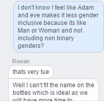
I brought up the fact that Adam & Eve could be seen as less gender inclusive because although it includes Male and Female it could exclude non-binary genders. In the end we decided on Eden, as it linked to the leaves being the garden of Eden and is also a gender neutral name.
 |
| Logo by Rowan |
Wednesday, 2 March 2016
Responsive - Crispin Orthotics

The designs are meant to appeal to adults, 18+ as a lot of the designs they already have are more suited to children. I still want to make something fun and visually appealing, rather than just a bland pattern of stripes or something.

I am interested in this brief as I have been doing some pattern work in my collaborative responsive and am quite enjoying it. Pattern is something I have not really worked with before but I would like to know more about creating patterns, how to do it etc and this seems like a good opportunity.
I am also quite interested in tattoos and as orthoses are for the body this might be a fun and appropriate project to explore some tattoo imagery.
Tuesday, 1 March 2016
Design Bridge - Patterns Part 2
Since the first patterns I made ended up looking too feminine I got thinking about ways that could be a little more masculine or neutral. The watercolour lino prints had been quite soft so I thought maybe something more bold and stylised would work better.
I started trying to translate leaves into geometric shapes, and patterns based on these shapes. I have been working in the colours that we decided on from the survey, green/turquoise, orange, and yellow. I think paired with the black background it looks quite dynamic. Obviously these are just quick idea sketches that would need to be refined, but I like the way this is looking. I think the patterns and colour schemes are obviously gender neutral. The colours are bright and appealing to a wide range of audiences, I think it's got a bit of a youthful look to it, quite energetic and fun.
Ellie said a tutor has advised us not to lose sight of why we chose the name 'Taboo' - one of the reasons being Adam & Eve covering themselves with leaves, so I've done some really rough sketches of these patterns over body shapes. I don't really know if they'd be at all successful.
Subscribe to:
Posts (Atom)