Wednesday 29 April 2015

OUIL406: VIS COM EVALUATION

What skills have you developed through this brief and how effectively do you think you have applied them?

I have really developed my digital skills this module! Mainly due to being forced to use digital media at least partially for two briefs but I have really learned to love using digital media. I hated Illustrator before this module but when faced with having to use it, its actually really fun and I definitely want to use it a lot more in the future. Although I have enjoyed it I've only scratched the surface with what I could do with it and I'd love to play more digitally and unwrap the mysteries that Photoshop and Illustrator hold. 


What approaches to/methods of image making have you developed and how have they informed your concept development process?

Storyboarding was something new I did during this module. It led me to think about animating in terms of steps and helped to break down how daunting making a gif is when you've never made one before. This also kind of made me think about narratives as the storyboard for the gif, though only a few seconds could be translated to longer animations or comics etc. 

Roughs are still super important especially when planning something to be done digitally as you definitely can't wing it, especially with vectors! There at least needs to be a vague plan. I spent a lot of time roughing in these projects (maybe a little too much time roughing and not enough time experimenting). Particularly in the "greetings from" project I ended up being led to my final idea through roughs, as I could find what did and didn't work, and get new ideas from drawing out my initial ideas. 
What strengths can you identify in your work and how have/will you capitalise on them?

This has not been a strong module for me so I'm finding it a little hard to think about the strengths. 
The biggest strength would probably be how much I have been able to develop digital skills, as that is something I really wanted to gain from this course. I have made images digitally - with Photoshop and Illustrator, as well as editing and developing traditional processes digitally. 
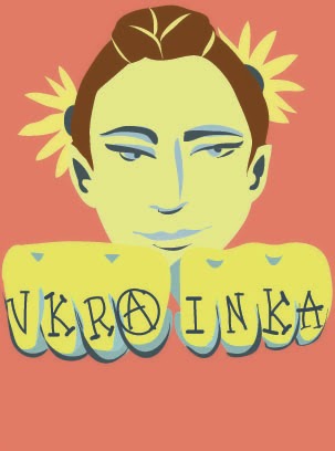
Although it wasn't my best brief I think my "Greetings From" Middle Earth postcards show how much I have enjoyed working with illustrator as I thought it was literally Satan before this project. Also during "Persons of Note" I chose to re-visit illustrator to create my postcards and stamps and ended up creating some images that I definitely could not have made digitally at the beginning of the module. 

During the end of the "Persons of Note" project I started to get more experimental, which is good I definitely want to do more experimental work but I'm kind of disappointed that the push to do it came for me near the end of the project when it would have been more helpful earlier on. Though this is a sign that I should definitely not be afraid to be experimental and make more mistakes in the future - Like the bear collaged out of Putin's face.
What weaknesses can you identify in your work and how will you address these in the future?

Due to life circumstances getting in my way this has been one of my worst module's. I have been utterly terrible at managing my time, though I had started off improving my time management all of that seemed to descend into chaos this module. I especially did not plan my time very well over the Easter holidays, in the future I will definitely put more consideration into planning time that isn't timetabled at college, including evenings - so I don't fritter away important time on not important things. I will continue using my diary, calendar and timetables to plan my time until it is ingrained into my daily life to do this for everything and pay attention/stick to my plan!!

In the "Greetings From" brief I got off to an incredibly slow start. Initial ideas has been a problem for me before, and the project seemed kind of daunting with so many options I didn't really know where to start with it. I think in the future to combat this I should just start off with really quick immediate brainstorms, research and sketches just to get the ball rolling even if they're utterly terrible and lead me nowhere. Then at least I would have made a more interesting start to the project and would have something to show in a crit.
Identify 5 things that you will do differently next time and what do you expect to gain from doing these?

  • EXPERIMENT - I am going to experiment more with media AT THE BEGINNING of the project so I can try new things, broaden my skills, get craaaazy, maybe end up with some cool interesting final images
  • PLAN MY TIME - Like properly. I do use my diary to write down events and plan some things but I need to thoroughly timetable my weeks. I will probably go down to learning support for some help with this cause I'm rubbish at time management. From this I will gain time management skills for life - and also a sense of calm when I've got things done on time.
  • HIT THE GROUND RUNNING - Start off projects with LESS THINKING and more DOING. Obviously some thinking but less worrying and wondering and more just drawing. This will help me because then in early crits I'll have more to show and more routes to take. I think this will also improve my visual thinking. 
  • LEAVE PERSONAL WOES AT THE DOORSTEP - Though this can't always be done I think if I tried my best to focus on work at college and leave personal problems completely out of the college area I would be in a better mindset for working.
  • KEEP UP TO DATE WITH BLOGGING - usually I do but I fell down in this module. By keeping up to date I would be able to document important crits, thoughts, critical instances etc as they happen and not try and catch up on them weeks later!

Tuesday 28 April 2015

Vis Com: Persons of Note: Final Images & Evaluation


My poster is one of the works I am most pleased with. As I know I am not great at lining with a tablet I drew the linework out traditionally  and then added colour in Photoshop. Using blue and yellow primarily - as that is the colour of the Ukrainian flag that Lesya is pictured holding in my poster. I am really happy with the how the colouring of her came out, I think it is well balanced in the two colours. 
The bear was initially going to be white with just red accents  so it didn't overpower the image but when I had done this it looked incomplete (I wish I'd screenshotted it now). I got feedback from my friends on what to do and they suggested colouring the bear a flat red - slightly more muted than the accent red. When I did this the whole image kind of just came together. 
Overall I am happy with the poster but I did rush the background as I was trying to get it done by my print slot - if I had worked on it longer I definitely would have done more thinner sunbeams and probably in a slightly different colour as this shade is quite close to the yellow colour I used on Lesya's body. The circle framing the face and shoulder area really works though and draws focus to this - the sunbeams then leading you through the image. 

The colours of the poster are a lot bolder than those of the postcards and stamps but I figured thats okay because the poster is meant to be big and eye-catching and powerful looking whereas the postcards do not need to have the same effect. 


Although the colours of the postcards are more muted I am still sticking to the same colour schemes. I chose the muted reds as the background to show how Lesya defied the Russian Empire, and used several different tones of yellow and blue throughout each image to link it back to the Ukrainian flag.

I really like these because it was a more obscure way of presenting my person as she is from a completely different era from the punk movement but her spirit is much the same and is very relevant in modern Ukraine. In a way I wanted to present Lesya as a beacon of hope for modern day Ukrainians.

I created these in illustrator and for once in my life really enjoyed just working with shape - I've said once before but this inhibited me from falling back on line as a crutch, and I really love how these pictures have turned out!

If I were to change one thing about these it would be to make all of the red backgrounds the same to unify all of them as they are all slightly different shades. Unfortunately I didn't think about this until I had already printed them.


I had invested a lot of time into my postcards and poster so for my stamps I wanted to do something simple. I decided on badges as they relate to the punk theme I pursued. They depict the name of her poem 'Hope', 'Glory Ukraine' In Ukrainian, The Ukrainian Trident and a sunflower which is the flower of Ukraine. Although I could have invested more time into these I think they are pretty cute - and as they are only small I feel that the images serve their purpose. As a standalone piece I'm not sure they make sense but when accompanied by the other elements they definitely tie in. 

Sunday 26 April 2015

Vis Com: Persons of Note: Making of...


I really enjoyed working with illustrator during 'Greetings from' so I decided to create my postcards and stamps in illustrator too. This pushed me out of my comfort zone of being able to outline everything, but I'm having a good time with it - finding different ways of using tone and shape to suggest what's happening in the image. 
 I was unsure whether this image above looked best with or without a face. As the flowers, braids and colour scheme give the cues to who this is without it needing a face at all - also maybe the face detracted from the hands a bit?

I asked a few people and they all seemed to like it best with the face, so I kept it that way. 


 working with illustrator allowed me to experiment with a lot of different brushes to find which one fit my pieces the best.  A lot of the time the brush would make this illegible, so I had to find the right brush to make it legible but also give it a gritty punk look.

the yellow and blue colour scheme relates back to the Ukrainian flag. I thought that doing all of my images in these colours would bring a sense of unity to all the pieces (as well as using red to show the stand against Russia)


Saturday 25 April 2015

Vis Com: Persons of Note: Roughs


My first idea for the poster is one that I've stuck with because I really think it just fits the feeling I'm going for which is a kind of revolutionary, powerful, Ukrainian uprising kind of feel. Lesya would be depicted conquering a bear, holding up a Ukrainian flag. The theme of this rough was inspired by the painting below, as I thought Lesya seemed like a leader in keeping Ukrainian culture alive within the Russian Empire. 


I really struggled to come up with ideas for the postcards especially to have them all fit together in a set. 
An idea I had was to display features of Lesya which are prominent to Ukrainian culture for example, the braids, the vinok and the beads. I kind of thought this was maybe a bit cliché and not exciting to look at. 


After coming up with the punk idea I had a lot more ideas for postcards


I especially like the ones basing around the jacket as they stray away from conventional portraiture and I think it would be an interesting way of translating my person of note into imagery without doing something too cliché. There are also different ways I can mould the same idea - like changing whats on the badges or the back of the jacket. 


For my stamps I thought I would roll with the punk theme and do various badges with different things relating to Lesya or the Ukraine on them. 

Wednesday 22 April 2015

Vis Com: Persons of Note


As Lesya's spirit of keeping Ukrainian culture alive is relevant now, what with Putin trying to reform the russian Empire and all, I started playing with the idea of a modern, punk version of Lesya. Still keeping key elements like the braids, but twisting it into a mohawk style. 


I started doing some experiments with photocopies and collage - to give a really DIY punk looking effect - I think if I had given myself more time to experiment with this style I would have pursued it further. I wasn't all that fond of anything I made so I decided against using that style in my final images.


I had some wacky ideas including a Lesya Ukrainka inspired pussy riot balaclava, but these were perhaps the worst drawings of my career.
Also I made a bear from Putin faces, this was just horrifying. 


Tuesday 21 April 2015

Vis Com: Persons of Note: Crit

My Intent:

  • Show Power (of the people)
  • Showing Lesya as the political activist and what she stands for
  • The stand of Ukraine against the Russian Empire
  • Modernised punk version of Lesya touching on todays problem of Putin trying to restart the Russian empire.
  • Lesya as a symbol of hope for the Ukraine.

Critical Reflection:

  • I don't think I've done enough work or experimentation
  • Finding myself not being able to come up with ideas
  • haven't tried out the style I'd really like to go down the route of
  • no finalised roughs as of yet
  • my roughs are terrible


Feedback:

  • Punk idea is pretty cool - use the punk aesthetic to my advantage and experiment with it. 
  • PHOTOCOPY EVERYTHING & do cut out type from magazines to give it that really DIY punk look. 
  • Collage everything! 
  • Print on really bad quality paper for the lo-fi effect
I like the idea of taking it down this route and I'm definitely going to have a play with these techniques along with other things - whether I'll be able to meld this with my current ideas is to be seen as I kind of have an idea in my head of what I want my poster to look like and I'm not sure whether this stuff will fit in with that. 

Saturday 18 April 2015

Vis Com: Persons of Note - Sketching


When I went to research Ukraine under the Russian Empire 90% of the articles were about Putin trying to reform the Russian Empire starting with Ukraine - This really set my project off as it made Lesya Ukrainka's spirit nowadays. I started off with a stupid collage of Lesya arm wrestling Putin. 

The first idea I had for a poster was Lesya conquering a bear - representing russia. A lot of  my project is centring round her activism and keeping Ukranian culture alive. 

I really liked the idea of painting her in blue and yellow shapes - like the colours of the Ukrainian flag this reminded me of Shepard Faireys 'Hope' posters for Obama - and as Lesya's first poem was called 'Hope' the caption would still be relevant. 


Illustrating some of her poetry might be a cool idea, though I'm not sure how I would single out which poems to illustrate. Above I did a vague sketch based on the line ' a lone hope is left the one thing that i own' 

Friday 3 April 2015

Shepard Fairey


Fairey's style seems to span for a want for freedom. His images look very revolutionary and somewhat propaganda like - they give a very powerful essence.

The bold colours and shapes used are really striking - his images get straight to the point that they're trying to convey.


I thought this image was pretty cool, as it still exhibits his style but the face is more simplified and cartoon-like rather than looking almost realistic like the Obama image.

Wednesday 1 April 2015

Rachel Ignotofsky


http://www.rachelignotofskydesign.com/work/

When the task was set these were the images that came to mind immediately as they clearly depict women of note. These images have strong, consistent compositions making them work really well together as a set - as well as just single images.

The images are informative - with the text identifying these women's major achievements but not overpowering the image. All elements of the image fit around the body, and in most the body draws the viewers eye to the written facts.

I love how these images are simple yet also complex, just working with flat colours and lines. I think they're a really great set!