Sunday 14 May 2017

OUIL603 Evaluation

I feel this module is one of my stronger modules out of all three years (though maybe not as strong as COP). It’s allowed me to just be able to develop my practice and being able to pick and choose briefs that will help me personally develop works for my portfolio.

Starting off this year I was just starting to notice where my tone of voice sat and this module has let me play with media and develop my practice, giving me a consistent and coherent tone of voice that is very clearly mine and I’ve thoroughly enjoyed watching my work develop.

I was completely self indulgent this whole module, so all of my work is very much based off briefs that appeals to me and is perhaps not the most commercial. This was simply because I knew I would make terrible work if I wasn’t invested in the brief, and as a professional I would have plenty of briefs I probably wont be so enthusiastic about, so I should spend my learning days doing stuff I like to really hone my practice. For me; this worked and I have a body of work that I am extremely happy with, I can always take these images and apply them to things to show how they would work in a commercial sense.

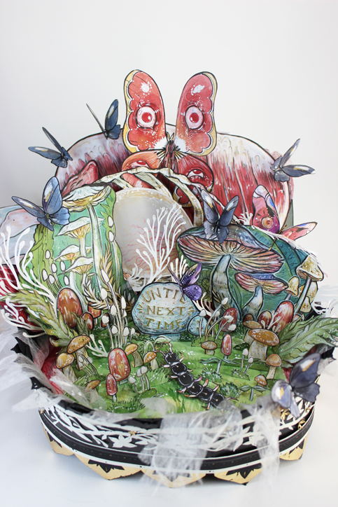
I have thoroughly enjoyed developing my practice in papercraft and printmaking. I did enjoy the semi 3D things I started to make for FMP as it opened up a whole world of freedom for me in terms of my work because it meant I could create completely different compositions while photographing things that would have taken much longer and much more effort just drawing. Though I don’t think I will do it for every future project, it is something I would like to look more into, as well as expanding on my paper craft. For the EOYS I’m looking at re-making something from this but larger scale so that will be interesting.

Most people I talk to comment on how different my work is and how far I’ve come since I started the course which makes me feel proud of myself, I’m going in a completely different direction to what I initially thought I would 3 years ago but I’m much happier with my work and my budding practice.


I’ve made a bit of money off my work this year so that’s promising and positively re-inforcing me, giving me some confidence than I can continue this as a viable career.

OUIL603 Project Report

OUIL603 Final Solutions

OUIL603 Statement of Intent Review


These are my statments of intent: I'm just going to write some notes about my rationale and what I think I have or haven't achieved this year.

May 2017

I think I have successfully developed a coherent and consistent tone of voice throughout my work that I can apply to a variety of different uses : including publishing, the music industry, posters, packaging / advertising.
 - I would still like to look further at advertising. I am unsure if my work is so commercial but I think it definitely could be adapted. An idea I've had floating around in my head is cocktail menu's or adverts, cause alcohol always has weird limited edition stuff.

In my FMP I finally got round to doing some monoprinting and have continued doing bits of lino printing here and there that I have incorporated into my work. This will continue in my future practice as it has been incredibly helpful in moulding my tone of voice in regards to shape and texture. Monoprinting is also good for me because there's a lot of freedom and spontaneity (for me anyway because I do not intend to make anything solely monoprinted), which is something I kind of need in my practice in some way shape or form.

I think this year I have achieved what I set out to do which was improve technical skills and develop a tone of voice, because at the end of last academic year I felt a bit lost about what I was doing and now I'm at least 5% clearer

FMP || Presentation boards

FMP || FINAL IMAGES

(It took me ages to make the issuu document so all the pieces that were meant to be double page spreads came out that way so, take a moment to appreciate that)

So here they are, the final images!

1. Front cover: full design below. I meant to follow the Folio Society's competition specs but ended up doing just a generic book cover.


2. a pattern shown earlier on my blog, made from monoprinted pieces; could potentially be used as a 'blank' inside cover.

Title Pages:

 The Bloody Chamber title page: Minimal  - similar to front cover, plain white background.
other pages also have title pages for The Company of Wolves and The Tigers bride which all fit into this layout. I didn't want the images to be as detailed as the actual illustrations, but just a teaser for them - like a title is for a story. I'm happy with how these turned out! I think together they're coherent and also don't look too different from the inner illustrations while having a little bit of a more minimalist feel to them.


I would ideally would have liked to have done a couple of smaller floating spot illustrations for this so they're not all images of massive scenes.

I think for the bloody chamber I focused the scenes that I illustrated a little too close together, however these were exciting scenes and if I continued the project I would potentially do many more illustrations for the beginning of the story.

What I really love about how all the illustrations turned out is that I was not limited to just using various reds, I was able to use a bunch of greens and blues which personally I find more visually appealing and exciting. The colours don't detract from the tone of the image which i'm really happy with!

I really wanted to properly show the front of the iron maiden in this, so I slid it behind the text, I'm not sure if I'm happy with it, it looked much the same with or without so I decided to keep it there but it might be a little too clunky.

Saturday 13 May 2017

FMP || Digital Tweaking

I brought the photographs into photoshop and started merging other imagery and textures to create a full, finished image rather than just a kind of shoddy photograph. This phase really pulled things together and helped me to accept and see the images as work that was actually good rather than unfinished things lying about.  


Looking back, this may have worked better as a spot illustration ad the grey background kind of pulls away from the fire, but it shows how I add to the images to make a 'final' 


I knew i would not get as much finished as I wanted to so I did a few rough composition ideas for a Company of Wolves illustration. 

FMP || More final Photographs


r


Realised I needed to take more photo's cause I wanted to get some Tigers Bride stuff done!!
Took these at home so they're not quite as good as the ones I took at uni - background paper isn't as smooth, lighting isn't quite as bright but they'll do the job.

Wednesday 10 May 2017

FMP || Final Photographs

A selection of the final photographs that I could potentially use for my final final images!!

I did not plan my time well and had to photograph everything in the studio, instead of the photography rooms. I could have gotten lights and a background roll out which may have made the backgrounds of the images slightly clearer but honestly - I was running out of time and figured the natural light would suffice and big professional lights probably wouldn't have made that much of a difference.
Whatever choice I made the photographs came out pretty well, I got some sharp shots from lots of different angles.

The photography let me get different angles on the more 3D items which gives me a lot to work with when I go on to play with the images digitally. This is pretty fun because it gives me more freedom with composition and different options to change the entire look of a piece without having to redraw an entire image, just chopping and changing different elements. I was able to twist and fiddle about with things while photographing them which gave me a variety of shapes and changes to use.

This was a difficult experience because I have not done this before and my time management and deteriorating mental health problems fucked my work ethic. The 3D stuff was interesting - construction wise cause I was basically just winging it.

I appreciate the fact that I can mix media, as my stuff thats solely papercut is a little messy but being able to digitally mash things together.

Tuesday 9 May 2017

FMP || 3D THINGS

I've made about half the 3D things I wanted to for this.

I have not really worked very much in this kind of method before but it is mostly papercut stuff. There's so many bits and pieces about.

I know the final images will be digitally enhanced so I"m having a hard time viewing my pieces as 'good' because I know they're all unfinished and so they look kind of rough and janky on their own even though I have spent a lot of time and effort on making them!!!!

I have some ideas in my head for what I want the images to look like once I've completed them fully; but I do have to take the final photographs to be able to edit them.

I took Jamies advice and added foamboard to the backs of things so that they would stand up properly for photographing purposes, it was a good shout.

The iron maiden is the pieces i'm most happy with because I think the paintwork on the outside has that really aged spooky aesthetic.

The pieces allow me to make some pieces that can be a little more abstract and unsettling but still capturing the narrative and the feel of the stories without being wildly blatant about things???

Saturday 6 May 2017

S7 : PERSONAL JESUS


A bit of a spontaneous idea; I wanted to do an MSI song and remembered they did this cover of Personal Jesus. 

From here I decided I was going to do a general concept for 'personal jesus' with three varying covers, a Depeche Mode one, a Marilyn Manson one and a Mindless Self Indulgence one. 
So far I only managed to get the general concept image and the MSI one done.

The general layout of the image is pretty obviously based off religious iconography of Jesus... doing the hand thing?
It might be a bit blasphemous but I don't think any heavy religious people are gonna be into my work anyway!
I added the phone because of the lyric "flesh and bone by the telephone, lift up the receiver I'll make you a believer" 


The MSI variant had to be pink, to match the video and basically their entire musical career. I'm cheating on the 'secret 7' rules cause this is my brief i'll do what I want to and I've added the initials of the band. 'MSI', just to be able to properly differentiate when I actually get around to doing the other two variants. 


This was a pretty spontaneous idea I think I did a whole one sketch of this, and I'm pretty pleased with how it's come out so far. It's pretty much exactly how I imagined it. 

I'm not sure what I'm going to do with the lyric sheet that I usually do yet though. 


Friday 5 May 2017

Tutorial with Jamie : 03/05/2017

All my stuff is kind of bits and pieces still getting towards a final thing right now. I know what I'm doing but I've come down with a spot of crippling depression and my work ethos has gone out the window. lol. 


My dangly bits and pieces connected to the wolf are kind of like this Cornelia Parker doodabber. 

( the bits and pieces weren't connected yet, I just proposed it as what I wanted to do with the pieces: Jamie said to consider a large scale version of this for the EOYS)


3D things are pretty cool - Just make the damn things : Think about how they're going to work in context  - roughs of how they'll sit on the page as an illustration - not just how they'll be put together as an image you feel me? Think about adding backgrounds or other things digitally.

Laura Carlin's Book:

http://www.lauracarlin.com/a-world-of-your-own/jlrhl4hz9ktajiujw4t7bkj3ist3eo

uses a mix of 3D / 2D drawings together - Think about doing something similar, adding extra bits, mixing things together (definitely, thats like my favourite thing to do, but I've got to get the pieces finished first ahhh) 


The little excess scraps of paper are cool to have around cause I can mix and match with all the bits and pieces. 


compared to cop work it's pretty restrained (I mean my cop was pretty fucking wild you gotta admit)
maybe I need to let loose with it, I mean I like what I'm making. I just hadn't gotten all the weird stuff together. I don't really like making things just to cut them up (when its an actual image and not a textured piece of paper so I guess thats holding me back a little. I'm a messy worker and guess I should just embrace being messy at this point, like why try and be restrained??? Idk I feel like I don't realise I'm 'restraining' myself I just do what feels right for the project lol)

Questions brought up: Where do I see my work being? / my portfolio appealing to (I've done a whole PPP module and I still have no idea, especially right now I'm in this mental health hellscape it\'s not something I've been too focused on. I want to dabble, and don't want to limit my options) 

How does my COP fit into my other work? / Is it in my portfolio. 

-It's not in my portfolio but maybe it should be. 
The ideas behind my cop was the important part, the whole feminist thing and such - the image making was just some weird shit stuff that was appropriate to that and not something I see being interwoven with my practice so much?

What do I want people to think looking at my work?  
Again I don't know, generally I get the "thats a bit weird that" and I like that but not everything I make is super weird???


Anyway for this I should up the weird. 


S7 : Shake it out - Florence and the Machine


Image inspired by the line "I am done with my graceless heart, so tonight I'm gonna cut it out and then re-start" and "it's hard to dance with a devil on your back" 

I didn't intend this to be part of the series but after I made it I realised it fits the format and could very easily be applied to a record sleeve so I decided to include it. 

This was more feelings based for me so I think the imagery is a bit more visceral. It didn't come from a sketch I just started on it while I was listening to the song.


Friday 28 April 2017

Richard Hawley - Disgraceland

Guess who kind of forgot about this brief... it was me!


I did the 'proposal' for this in about two days. In that two days I realised I completely forgot everything I'd ever known about creating an image for screenprint... because I haven't screenprinted in a year, haha whoops. 

I basically had one idea and I was gonna roll with it, I realise it's meant to be like 'graceland' but I was getting 'wasteland' vibes - hence the muted - yellowey- deserted sandy look to the entire image. When I sketched it out I was just thinking of the sign-post and a pathway, as I was doing this I realised I could wind the pathway into the vague shape of a guitar - sort of in keeping with other posters made for Hawley. 

I realised I neeeded to do halftones so I could get some different shades of yellow throughout the image and swiftly realised I had no fucking clue what I was doing, ended up going through my blog from the past few years going through all the screenprinting notes I had ever made. Which helped to a degree, this is still a pretty janky halftone though. 

I tried to make the image mainly digitally because I thought that this would be an quicker, simpler way of doing it, I however was incredibly wrong.

I think I got fixated on the fact that this had to be an image made for screenprint so I spent ages painstakingly making this in separate colours and halftones when I should have made an image and found a way of ADAPTING that into a 3 colour screenprint.

Sunday 23 April 2017


Vague positioning roughs for the company of wolves. 


Wondering about bits and pieces for the final scene of The Company of Wolves. Wasn't sure how explicit to go, I mean that'd definitely take things up a notch but also... this man turns into a dog eventually, wheres the line between men, furries and plain beastiality, it's maybe a line I don't want to walk on. 


Rough for the bloody chamber: the mirrors all reflecting the main character. Shown from all different angles, dangling. 


Character sketches for The Bloody Chamber - trying to capture some innocence but also the 'grandeur' she gets from being married to this dude & all his riches. 


more bits and pieces, company of wolves plans.


Wednesday 19 April 2017

FMP BLOODY CHAMBER PATTERN


I decided to fiddle with some things, as I enjoy pattern making and hadn't made one for this. I used the bits and pieces I had monoprinted, & previously made, as well as drawing up the lily digitally!

I am really happy with how this turned out!! I didn't want to use any bright bright reds as it may be a bit cliche but I think the understated muted colours match the tones of the story while still alluding to horror and gore in a way. 

Since it's a pattern it's a lot of disembodied things which links vert closely with the paper-cut stuff I'm making for this project - so probably would not look out of place included in a book alongside them (even though I made this kind of separately from it)


I thought this kind of pattern could potentially be used on an inside cover of a  book where there are often those spare pages filled with colour (it's hard to find mockup templates of that inside page, so forgive this janky mockup) 

My bits and pieces of stuff definitely comes together more when I can bring it all into one digital image so I'm hoping that my paper-cut images will work out in my favour once I can edit  and mess with them them properly in photoshop


Tuesday 18 April 2017

BUFFY || More Sketches & Hiatus of the project

Roughing out some potential layouts. I liked the idea of doing something like a playing card - two people, kind of reversable. So the image would be a prominent character of the season and a prominent 'big bad' of the season.

I've started to kind of map up a Willow / Dark Willow image (it very much should be considered a sketch)

I'm trying to draw the characters in my style again but I'm not really happy with what I've made and I'm struggling to find a method thats going to work well for this project.

Ben said I'm struggling with it because everyone looks so generic because it's the 90's and fashion was terrible.

At this point I have to focus more on FMP and while I would like to continue working on this project I know it's not in my best interests for my portfolio or my time usage. I would like to continue this project on past the degree as a self-indulgent passion project as I do not know how long it will take to truly find the style I'm gonna work with for the project!!!! 

I would have liked to be able to create something more solid, as I have not been able to even make any 'final images' for this project. I think I just started on it too late and took on too much along with it to be able to finish this big project along with FMP. But at least it gives me something to work on post-degree. 

Monday 17 April 2017

FMP || Company of Wolves


Wow this film sure was an experience & surprisingly accurate to parts of the story too!

Watched it to get some ideas for imagery, particularly with wolf / transformation stuff cause that's always tricky to capture. WOW THIS FILM DOES NOT HOLD BACK WITH THE TRANSFORMING

like that is a real horror. I'm not sure if this is a game changer but it definitely makes me feel more comfortable with the amount of pure WEIRD this project can be. Not that I'm trying to restrict myself, it's just context isn't it? Like you kind of expect 'adult fiction' illustration to be 'sophisticated' or whatever but the source material is leading me down the path of just getting real weird with it. 


FMP - Copying the folio society competition specs


I could only find binding dimensions so I assume the inner illustrations can be within that size?

I'll have to ask someone about it or keep trying to find the specs but since the competition is closed for this year I'm struggling to find anything that isn't just "CLOSED"

Sunday 16 April 2017

Tutorial With Ben


FMP FEEDBACK
- Showed ben these experiments I'm doing, told him I'm just getting weird with it
- 2D but 3D thing is working well
- collage stuff, do more, add some found image stuff
- Good level of 'gore' suggested but not OVERKILL
- the final images should be not these pieces themselves but a good photograph of the pieces, capturing the 3D - then they can be touched up in photoshop & finalised
- I should aim to make 6 of these (I'm happy with that amount, its reasonable and gives me a good target to work towards!!

- I realised that I don't really know where this is going anymore because I removed all of my 'context' for the project. I figure since I've got the goal of 6 images I will go for a Folio Society style format of a front cover & inside illustrations etc. That way it feels legitimate and I can just make images focused on illustrating the stories &I guess I can transfer them to other things at some future point maybe???


Monday 10 April 2017

Easter Action Plan - EP

ANGELA CARTER - FMP - Priority

- AIM - 
6 Papercut Pieces - To Be Photographed. 

* Experiment with more collage & papercut stuff

*look up & experiment with pop up stuff

* Blog up to date on initial sketching stuff


BARELY SECRET 7

-AIM- 
3 MORE RECORDS & VIDEOS 

songs selected: 
Mindless Self Indulgence - Casio 
The Cure - Plainsong
Amanda Palmer - Melody Dean or Machete 

MONSTER GIRLS

* add backgrounds to finished papercuts (no new creations) 

*blog up to date 

BUFFY
(Passion project, going on the back burner, there probably won't be finished pieces for this project, but I will keep it ongoing, my main focus should be FMP now, so I'll do bits when I feel like it but it's kind of not important) 

*blogging up to date

Tuesday 4 April 2017

FMP || Research.. SORT OF


Ben told me to watch this thing to help my FMP, as with books it's stuff that's been done over and over  and over again so ya gotta find new ways of interpreting stuff.

Maybe my work is not just 'illustrations of The Bloody Chamber' but becomes something a little more bastardised. (which is cool cos The Bloody Chamber is all fairytales that have been twisted so its sort of open to a little more twisting)

So this is an interpretation of  Alice in Wonderland but my god it's the most horrifying things I've watched in a while. Alice in Wonderland always gave me the heebie jeebies anyway but this is next level weird. 

BUT I get the concept - it's an unconventional portrayal of Alice in wonderland, and it's good to twist the things 

Friday 31 March 2017

Monster Girls


With the use of some digital trickery I transformed this papercut torso into a full blown mermaid, with background. I think this whole project has really let me just play around with process - I've stockpiled loads of different textures for cutting and pasting, as well as scanning. 

I love having the ability to layer things up in photoshop as I think the added depth and texture is what gives me my unique tone of voice. I find myself increasingly happy with how things are turning out when I am working with mixed media - though I do struggle to tell when something is 'done' I mean is anything truly done? I think this image could have done with some neatening up around the tail - but I find that the textures and colours help to blend those little faults into the rest of the image so it's not such a big deal. 


I would have loved to have done a whole series of just different kinds of mermaid but since I'm now working on FMP and stuff the monster girls have sort of finished (for now, no doubt I'll be back on it as soon as I have a chance, cos I've got loads of ideas, and some monsters that didn't quite manage to get backgrounds yet)

I think I've definitely gotten more proficient in photoshop since doing this project as I've been able to experiment loads with different textures, drawing, editing etc and since I've enjoyed the subject I've made some really fulfilling work!

Tuesday 28 March 2017

FMP - Foldin' & Openin'


After talking with ben I decided to just get real weird with it. 

 This piece above is by Alison Woodward and I've always been totally inspired by this kind of style of intricate papercut / pop up stuff. I'm not looking to copy her style, because it's hers obviously but since I have been working with papercut a lot anyway I figured it could be really interesting to just play around more since I'd stressed myself out thinking too much about this project and I just want to have fun and make images at this point. 


This is a test I made, for a scene in the Bloody Chamber, it messed up a bit sizing wise so it had to open the wrong way, which isn't ideal. I incorporated a scrap photo of some meat behind it to make it kind of unsettling. It does kind of get lost in the back there, maybe it should be more prominent? I honestly forget it's there. 

Bit of a cliche colour scheme perhaps??

I want to add more detail to the outside of the iron maiden, so it's kind of embellished and decorative. 

I need to research into pop up books and see the mechanics of making things pop up and out all over the place rather than just opening. 


Monday 27 March 2017

FMP || info, articles, wall of texts, my notes, reference

https://www2.stetson.edu/library/green/wp-content/uploads/2014/01/prize_2010Formisano.pdf

" Her female protagonists often take on empowered roles where they rise up against oppression and fight for both sexual and political equality. The actions of these women are direct reflections of the feminist movement that took place in the 1970’s"

While it cannot be denied that Carter is most definitely a “glam rock” feminist, using colorful imagery, sensuous prose, and her outrageous imagination to portray her message, the controversial aspect is whether this style is successful. Using her female protagonists to enact her feminist beliefs, critics such as Patricia Dunker and Avis Lewallen, argue that she takes her feminist activism too far in the sense that her stories become too fantastic to serve as an effective tool to promote feminism.

Although classified as “glam rock,” Carter is still a highly effective feminist author because she uses her intense, extravagant style to literally shove feminist ideals into the face of the audience. By doing so, she makes it impossible to ignore her feminist message.

Carter attended the University of Bristol from 1962 to 1965 where she studied psychology, anthropology, science fiction and horror comics (that's a neat selection of things)

'Radical-libertarian feminists stressed that just because a woman’s anatomy deems her female, that does not necessarily means she can only possess the usual characteristics of beauty, ignorance, charm, serenity, and peaceful. They argue that patriarchal society uses rigid gender roles to keep women passive and men active. ' [suggests women don't need to reject 'characteristics associated with femininity, but they can take on 'masculine' characteristics (power etc.) without compromising femininity - characteristics shouldn't be gendered in this day and age but society is still pretty patriarchal soooooo]


'Carter portrays the female heroine as resourceful, clever, and persistent young woman, characteristics that were foreign to women at the time under patriarchal roles, who are able to succeed without any assistance from a male figure'

 In Carter’s re-write, her radical-libertarian message about empowering women is enhanced when the victimization of women is overturned by Blue Beard falling victim to the mother and daughter instead of the other way around, which was usually the scenario because of males supposedly dominant status over women (Makinen 6). As Carter describes in this tale, Blue Beard saw his “dolls,” women, break free from their “strings” and live their lives for themselves (Carter 39). Here, Carter is promoting the radical-libertarian idea that women need to break free from male oppression and become empowered. Only after they are empowered will they be able to live for themselves or live their own life. Carter continues to promote her radical-libertarian beliefs specifically in The Bloody Chamber, where Carter’s female protagonists are pursuing their sexual desires and redefining 8 their sexual identity as well as fighting for sexual equality with men, which was the biggest goal for radical-libertarian feminists during the feminist movement. Carter promotes sexuality by not letting the male sexual desires take dominance. Instead, Carter pays particular attention to reinforce the equality of the sexual transactions between her male and female characters. This equal transaction is seen in “The Tiger’s Bride” between “Beauty” and the tiger. In the scene when Beauty and the tiger go down to the river, the tiger strips naked for her and in return she strips naked for him revealing to him the “fleshly nature of women” (Carter 65). The tiger does not declare that “Beauty” get naked for him and get nothing in return. Instead, by both of them stripping naked, Carter is asserting an equal transaction (Makinen 6). Merja Makinen notes that the beast figure, the lion, is symbolic of a sensuality that women have traditionally been taught harms them (6). When they embrace this sensuality, however, it empowers them and gives them a new strength and awareness regarding their own self and their other, in this case the lion (Makinen 6). Another example of equal transaction between men and women is seen in “The Company of Wolves,” when Little Red Riding Hood tears off the wolf’s clothing and throws them in the fire because his are also gone (Carter 118). From the scene, Carter puts women on an equal plane with men; Little Red Riding Hood returns the feeling of violation that the wolf, man, inflicting upon her (Manning 4). The equality that evolves from the equal sexual transactions between man and woman, as Carter depicts in “The Tiger’s Bride” and “The Company of Wolves” is significant and important in women’s fight for freedom from patriarchal roles and sexual oppression.

Critics like Makinen argue that in “The Tiger’s Bride”, the beast, in this case the tiger, is a direct representation of female sexual desires (7). The beast represents the sexual cravings of women. In “The Tiger’s Bride” when the tiger licks off each successive layer of skin until the woman is transformed into a tiger herself (Carter 67). The protagonist acknowledges and acceptes her autonomous sexual desires (Makinen 6). By accepting her sexual wants, she is making them part of her being, which is seen by her becoming a tiger, a beast, since the beast is symbolic of female sexual desires (6).

I still maintain that Carter’s re-writes do not promote women re-enacting male pornography, but instead women searching for and regaining possession over their libido (Makinen 7).


http://www.independent.co.uk/arts-entertainment/books/features/angela-carter-glam-rock-feminist-6097243.html

[Carter Was] well able to imagine women as flawed and imperfect, 

 [this is good as it doesn't idealise women as sparkling flawless beings as they are often portrayed in the media; a false presentation of women which erases integral parts of existing as a female human. Giving women in media flaws supports the fact that women are in fact multi-faceted people and not personality-less dolls put around for male attention]

Her subject-matter is not outdated. Her take on sex, for example, still has something to offer us. Even as we see a return to the sentimental-domestic ideals of the 1950s, sex saturates western culture as never before. Sex on whose terms? Sexual freedom remains problematic. Freedom on whose terms? Women have been offered the chance to become the makers and users of pornography. Women who decline are labelled prudes. 

[double standards on sex for women, women who have sex are branded as whore's women who don't have sex are prudes. There's a virgin/whore thing going on, where women are either angelic and flawless or absolute satan "games like this claim to have multiple choice but really it's between mother teresa or baby eating, i'm just saying some middle ground would be good"] 

"I've read lots of her books. She was a pioneer who created imagery about female space and female storytelling. She's not just a magical realist. She was female and used magical realism for female purposes. She opened doors for me through which I could walk to enter a new space and own lots of bits and pieces of culture. For example, she took the music hall tradition and delighted in how women could own that and play with it.


Reading these articles have helped me get some more insight into Carter's writing and feminist stance
I had been told that Carter herself did not call herself a feminist, but I cannot find a source for this so far so I don't know. I did read that The Bloody Chamber was not intended as 'feminist' interpretations of fairytales, but creating new tales from the latent content of fairy tales. Anyway I'm a raging feminist and will be exploring the project from a feminist viewpoint!

I'm pretty interested in this term 'Glam Rock Feminism' - it sounds like something I can get behind.