Thursday 30 October 2014

Sketchbook Task 2 - Line

This task was to draw 3 dynamic figures 4 times focusing on line quality. 

These three were done fairly quickly to get started. A simple line drawing, a continuous line drawing and a more tonal piece. The first two drawings have the best line qualities as they are strong lines. The media even though its just a fineliner gave a much bolder quality than the biro. 


I love the above drawing. Although the lines are sketchy, it translates the horror film feeling of the reference image. Extra lines have been used to convey shadow and 3D contours of the face and body. 


I enjoyed working with two different colours. I was able to do a vague sketch before adding the lines. This also added more depth to the images as it could convey shadows and movement more adequately than just one image.

Some poses were difficult to draw but drawing them over and over gave me the chance to keep improving the images. Figures are one of my favourite things to draw so working with them was a delight however I would like to start working with different aspects of horror films than characters.

Tuesday 28 October 2014

Photoshop Workshop 2

Using layer types & select tools to add colour to the image. Below I have used the 'screen' option so that everything that wasn't white turned blue, then added an accent colour by using the polygonal lasso tool. This first image was an experiment, so it doesn't look even close to a finished image but it develops from here.   


Adding texture, with a scan of my scarf. When I used the multiply option the image pasted over the fabric texture which looked like it was printed into the fabric, it gave a really interesting look.  


Elements of the image have been traced into block shapes giving the image a more defined, graphic look but retaining some of the texture and organic flow of the original image. I absolutely love the pastel purple of this image, it gives it a soft somewhat vintage vibe. 


I tried altering the colour so it was a much darker shade of purple but it's much too overpowering, although this does bring out the scarf texture. 
Below I have tried to make a best of both worlds, the darkest shades define the shape but the details of the tape and tonal work are lighter and easier on the eye. (Though I still love the pastel purple image)


Monday 27 October 2014

A Day In the Life - Roughs

In order to make these roughs I highlighted the main themes of the article; resisting temptation, achieving your goals and decision making, and based the images off them. 


These two roughs were well received. The imagery is obvious and perhaps cliché but the theme of temptation is clear through the characters face and body language. The portrait layout is most effective as the size of the burger suggests a power over the person. 


The off centre composition and bright rays shining from the apple are eyecatching. Temptation is suggested by the apple - a classic representation of temptation however it is a little abstract and if you haven't read the article the image doesn't hold up by itself. This might be intriguing but other designs were much stronger than this one. 


 These two portrait roughs were some of my weakest as they didn't encapsulate the feel of the article. They focus around achieving your goals, my crit group advised that these images would link more to the article if they had some form of overcome temptation in them but as they were the group didn't understand them.


Out of all my roughs this was one that recieved the most positive feedback. The image is somewhat abstract but clearly conveys the message of being in two minds - relating back to the decision making element of the article. I was unsure of whether the question-marks were necessary but the feedback concluded they weren't needed as the image was clear enough. This is one that has been chosen to be one of my final images. 


In the two above images another classic temptation visual is used in the form of an angel and devil on the shoulder. I felt that the initial drawing was too cliché and didn't make full use of the space, as there is a lot of negative space above the character. The second image uses the same idea but having the angel and devil fighting gives a real sense of conflict that decision making and resisting temptation can give. Also the characters head at the bottom, looking up the page, is a way more interesting use of the space.
This image is another that my crit group suggested to be in the final images, which I loved because when I drew the image I loved the idea but wasn't sure if it would work.


Above is the final image that was chosen to be in the final image but it needs some revisions. Running towards the goal is a good message however it does still need an element of temptation behind the character. A suggestion was hands reaching in and offering tempting things.

I am happy with the three images that have been chosen, I think they all work well with the article. I do need to develop some further and make them work as a set together. As you can see in these images only yellow and purple have been used, something really drew me to this colour combination. There's a definite contrast between dark and light, which could subtly suggest good and evil but I will have to test out some other colours to be sure different combinations wouldn't work better.

Thursday 23 October 2014

Visual Language Sketchbook

The task set was to create a minimum of four sketchbook pages based on a theme that could be selected from a set list. I chose Classic Horror Movies, as I will take any excuse to channel my spooky side!

I initially went for black ink as I wanted to give my sketches a monochrome, dark, old movie look. Though working in a sketchbook way allowed me to experiment and make some terrible pictures. The drawing on the right was done in tipex over black ink and I love the gritty way it's turned out.


Adding the splash of red to these images I think really added to these drawings as it framed the character, plus the red is a really great horror colour! 
The drawings focused around classic characters rather than any other aspect of classic horror films, so Dracula-esque Vampires, Frankenstein's monster, Werewolves etc. I really think I should do some research - maybe watch a couple of old horror films so I can take aspects of the vibe and scenery to draw instead of just characters. 


 Particularly with Frankenstein, you associate the angry mob with horror films so here I have attempted some angry mob drawings. I definitely should have found a reference for these because trying to figure out how people hold torches and pitchforks is more difficult than you'd imagine.

Although the crowd in the second sketch isn't complete I think that the atmosphere of an angry mob has been captured. Using a pen that smudged when water was applied allowed me to create some really fantastic grey tones while retaining a darker outline, with some more control it could be a technique I use more often.


Below I learned a lesson about spacing of images. The drawing was supposed to depict a werewolf transforming but the image ended up looking a lot more lewd than intended. In the future I will definitely plan the spacing of images a lot more efficiently!

Tuesday 21 October 2014

Studio Brief 2 - Day in the Life

 I've got the article on self control and it starts off simple enough but then its like 'resist temptation so you can achieve your goals'. It's fairly abstract and I'm having a tough time even thinking about what to draw.

The easiest way to get ideas from this article was to split it up into its main points, the ones I picked up on were

  • resisting temptation
  • achieving your goals
  • decisions

[I had a picture but its low quality so bear with this text post until I get another picture]

Initial sketches show a lot of imagery based around making choices as that was a heavy theme in the article. Simple everyday situations - people choosing items at the supermarket etc.

A quote from the article talked about resisting the temptation to smoke by thinking about the negative effects of smoking, I did a sketch based on this but it was suggested that smoking is not a good thing to focus imagery on as it detracts the subject from temptation to something like addiction. However this same idea could be applied to many different tempting things.

Monday 20 October 2014

Studio Brief 1 - development & final & evaluation

Although it was between 'Sean Bean deaths' and 'Things that Happen in Fab Cafe' I only ended up developing the Sean Bean theme as I thought that it was the more exciting idea and was most feasible to create in the amount of time I had left. 


This idea had already been done during the crit so I was able to get some feedback on it. The image shows a single Sean Bean marked out with the different deaths, I thought this idea was good because it would give the typology an info-graphic style look however my crit group thought this would not be successful as the whole body would be down the middle of the page, making it small and also leaving a lot of negative space. 

  
The most challenging part of this project was actually drawing Sean Bean, as I didn't want to have to draw a fully detailed character each time but simplifying his face was difficult. In the end I think I managed to narrow it down to main features of nose shape, small eyes and long-ish wiggly hair, all of which were extremely simplified. (This can be seen in the image of Sean Bean Ghosts below). The cartoon like style gives a funnier edge to the image, making the morbid theme more light-hearted. 


My initial idea was to have each Sean Bean causing the others' death, accidentally but upon sketching this out I found it was really difficult to have them all link, especially ones such as 'Run off Cliff Chased by Cows' so I decided this idea - although it would be funny would not be the best for the final image. 


The final idea I came to was ghosts of Sean Bean's characters, which is pretty fitting with them all being dead. Using gouache allowed me to create flat colours in different shades of the same colour, which in blue made the characters look really glowing and ghostly, which looked totally cool and fitting with the theme.

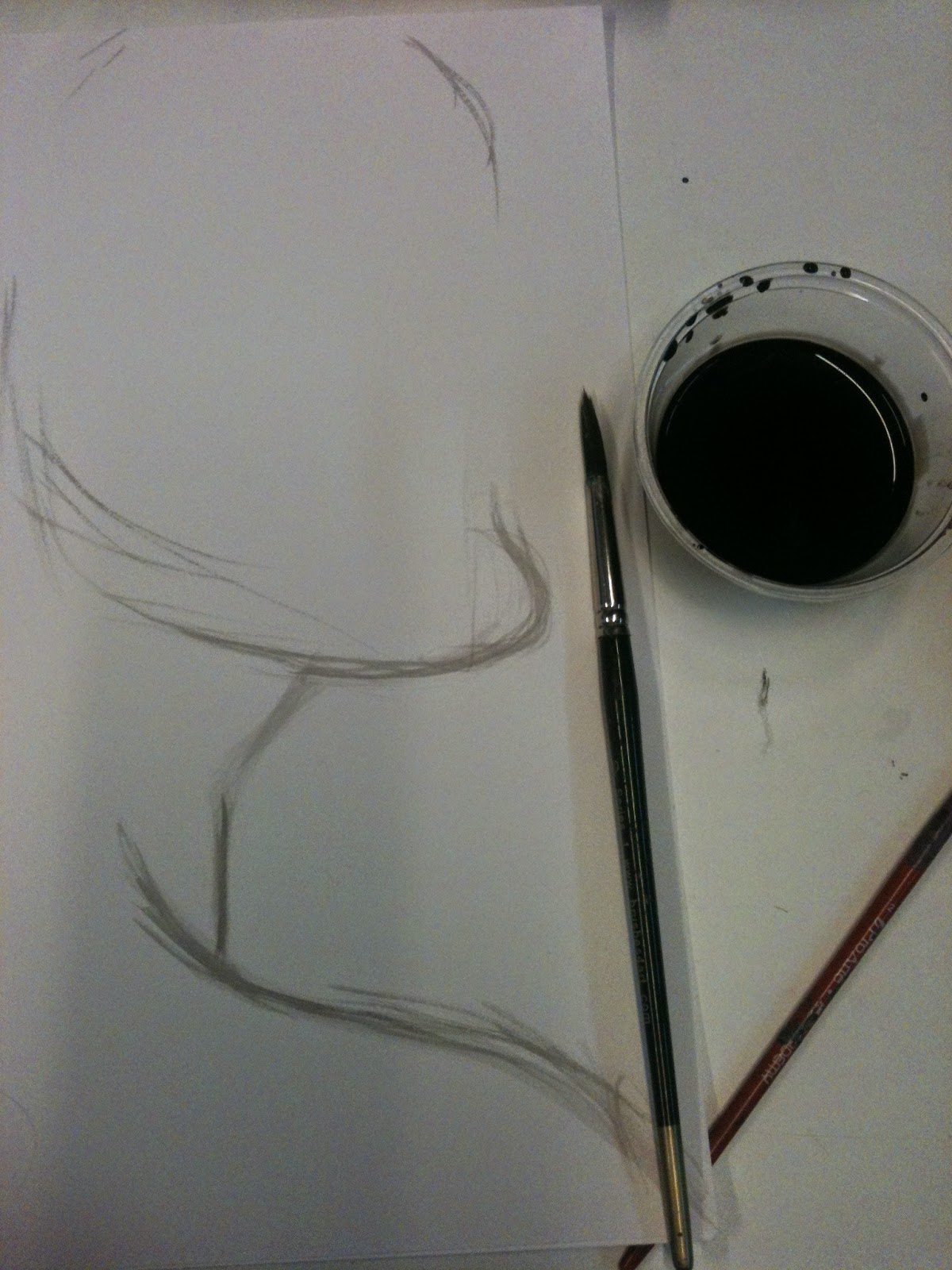
Below is the A3 sketch I did, mainly for layout purposes of what the final image would vaugely be.


Final Poster
Evaluation

For the final poster depicting an A-Z of Sean Bean's characters deaths I decided to portray all the characters as ghosts, with some indication of the death upon them - somewhat inspired by the ghosts in the film Stardust, who live in a permanent state of how they died. 


In my development I used gouache to paint the ghosts which gave them a great, dead and ghostly look to them. In this photograph they seem to glow in a ghost-like way too! So I used this medium in the final piece as it was successful and gave a bold look to the image, whereas something like watercolour would have given a softer effect and completely changed the tone of the poster. I intended the poster to be funny and the bold colour suits this, a softer look would have made it look more sombre and wouldn't have suited the tone. 

The colour is something I got most positive feedback on from the rest of the group, I think it is particularly strong and it was an appropriate choice to step away from just black and white for the image. 

To add to the humorous side of the image some of the ghosts are interacting with each other - the group of shot Sean Bean's playing cards in the corner and the two hung Sean's high fiving. While this is funny it would have been more successful if all of the ghosts had some kind of action, as the more static Sean's are not as engaging within the poster. Another thing I would change on the poster are the faces, as they are simplified I could have executed them way better and would like to have had some more uniformity amongst the faces, as some have ended up squashed and distorted. 

Tuesday 14 October 2014

Photoshop Workshop

Using the ink drawings done last week to enhance/edit in Photoshop. The image below shows the original image which is covered in paper shadows (from the water affecting the paper) and has some unwanted ink spots on it. 
Original Scan of image 

Changing the levels of the image can enhance the white and black tones in the image, by doing this some grey tones are eliminated. When I changed the levels the grey tone of the paper was made white, so the background of the image looks flat rather than bumpy (good times).

Changing Levels
This process made the mid-tones lighter which, I think has made the image more successful as it looks more like the image does in real life but also makes it look less dark and dreary and more crisp. Plus the tape looks almost the exact colour of a real cassette.


I made another version where a lot of the mid-tones have been removed, making it just a black and white image as I wanted to see how the lines worked by themselves. I don't think this worked in terms of a complete image. The grey tones of the image worked well with the lines but by themselves the lines look kind of shabby, maybe this version could be used to add colour to digitally in a future session but I don't like it by itself.
An edited version 


Monday 13 October 2014

Self Evaluation

How effectively do you think you have tackled the first part of this brief? have you been able to exhaust your ideas? How well have you used research to support the development of your ideas? Has drawing allowed you to visualise your ideas and evolve them further?

Although I didn't manage to do pages for all 10 themes, but I did come up with a lot of themes which were developed into what's seen on the pages. I wanted to make sure that the themes I developed were not too similar to each other so there are a few that had to stay in the 'list' stage as it would have been too 'samey'. Over all I think I have effectively tackled this stage of the brief as I have had and developed a lot of ideas, both successful and unsuccessfully.

Since the project is an 'A-Z of me' overall, the themes I chose were things I generally knew a lot about. The things I had to research mainly are the ways Sean Bean has died in films (25 times, wow) and finding an alphabet of things, though I tried to come up with as many as I could off the top of my head. I think this might have wasted time thinking too much when I could have been researching via secondary sources.

 I think I  did spend a little too much time making lists of themes rather than  just trying to get drawings down on the page but when I did draw my ideas out I found that the visual ideas were easily developed. Drawing allowed me to find what style and imagery would or would not work in each theme, this is most evident in my 'Goth icons' theme.

In light of your feedback what theme/ideas do you intend to develop into a final deliverable poster?

The 'Sean Bean Death's' theme is one that had potential to be the theme for the final poster because it's funny and  something that most people would be familiar with if they saw it on a poster. The feedback in my crit swayed towards this theme as well, but it was suggested I create new, outrageous, deaths for the poster.

Another of my stronger themes was 'Things that happen in Fab Cafe'. It was said that this theme could have a purpose - of informing about Fab Cafe  even though some of the things would be pretty negative. This was also a humorous theme (a pattern occurs) I definitely think humour was part of my stronger themes that made them successful.

I intend to develop both of these themes somewhat to see what would make the more effective poster.

Outline briefly how you intend to generate the final deliverable artwork - consider media method, design and application What are the next steps required in development and refinement of your poster?

I definitely need to develop my two themes so I can decide which is most appropriate. With the Sean Bean theme I will be thinking up more elaborate ways for him to die in films whereas the Fab Cafe poster would be more based around the layout. I am going to do some (refined) roughs for these themes explore these themes further.

I have a few ideas about how I can make the Sean Bean poster work, one I thought of earlier was just having a single Sean with all the 'wounds' from various deaths marked on but the people in my crit group were not so keen on this idea.

Thinking about media - I think something bold would be best perhaps acrylic paint, gouache or markers. The two themes are better suited to bold opaque colours or thick lines rather than ink or watercolour washes as those media give a softer feeling and I do not think that would be appropriate for this.

Studio brief 1 - A-Z of Me, Typology -ideas


My first sketches were really rough, I was just jotting down whatever came into my head cause I was struggling to think of ideas but this resulted in absolutely terrible roughs so I had to find a new method of working. For me it was easiest to write the ideas down first rather than go straight to drawing, though I think I did waste a lot of time trying to create full A-Z lists rather than just drawing based on a few ideas from the list. 


This page was things found in the Bioshock series, there was no real deep idea to it other than Bioshock is something I like and could compile a good list of things about. Some of my most successful sketches are on this page, but I found concepts such as mind controlling triggers quite hard to illustrate in one image (without words, too). A main problem with this idea is that people would probably only understand it if they were also fans of Bioshock. 


This is one of my favourite ideas! An A-Z of Sean Bean Deaths. (This relates to me as Sean Bean is my assigned male actor counterpart). I was delighted to find he had died 25 times in film and TV but fitting those into the A-Z was quite the task. In these sketches I found it really hard to make it look like Sean Bean, so if this was developed further I would have to find a way of simplifying Sean Bean's face. This idea is fun, I think it's pretty recognisable as people know Sean Bean as the guy who dies in films, and there are loads of possibilities to make this funny!


Things that Happen In Fab Cafe was a wild idea and all the images are based off real life experiences there (you may notice some familiar faces creeping in). Although it's based off Fab Cafe the images could be applied to any bar scene so I think other people would be able to relate to this image and find it funny!


Initially I thought of doing an A-Z of hairstyles I have had but when I started drawing the shaved hairstyles came naturally. It's a pretty simple idea but it's got a little bit of a twist, what with the hairstyles being alternative. The images focus more on the hair because the face isn't included and I really like the effect this gives. Although there are a lot of styles with shaved hair I'm not sure there would be a real A-Z without making a few crazy ones up (which I'm not against). 


The style of sketch in this is a bit different to the others, I wanted to give it a spooky tattoo-flash style feel to it. Although I enjoy this style the theme itself was fairly limited and it was hard to think of spooky things that would be recognisable. 


This theme was actually 'Things to do in Middle Earth' with things such as 'go swimming with little hairy women',  'simply walk into mordor' and 'braid your beard'. The idea itself was interesting but when it was drawn out it looked just like things in Lord of The Rings rather than the initial idea.  I added a little colour on these scamps just to start thinking about how this could develop and what colour would be appropriate to the piece. 


Goth icons was so much harder to do than I thought it would be as styles are so different and some people like Tim Burton and Vincent Price translated well into a cartoon style but Siouxie Sioux didn't because of all the small details on her makeup and hair. It was also really difficult to find a full A-Z as not many names start with Z. 


When I started the page of eyebrows it seemed like a much better idea than it turned out to be. Initially all the eyebrows seemed to be noticably different but upon another look a lot of them are just eyebrows (to the untrained eye). This theme could have been improved by applying the eyebrows to something rather than just having them floating on a page. 


This theme of 'Things that make me cringe' was so hard to draw as I kept cringing thinking of those things. This theme really focuses around me and doesn't really branch off onto anything else, I'm not sure if it could. 

Drawing from Observation

Drawing something that is physically in front of you, translating something that is 3D into a 2D form. When drawing from reference the subject has already been made 2D. It makes you think quicker and practice drawing things in a limited time - a useful skill for illustrators that may need to work to a quick brief.

Drawing this object four times definitely gave me the chance to practice drawing perspective. I actually think in terms of perspective the first drawing I did was the best, probably because it was more sketch like, the object looks skewed in the others as I tried to go in with bolder lines each time. Despite this the last drawing I did is my favourite as the bold lines are there but the added tonal quality of the less concentrated inks gives it more depth and makes the image look more complete.


Tuesday 7 October 2014

Drawing From Reference

drawing from reference?

Drawing from a photograph rather than from an object in front of you. Usually quicker and sometimes cheaper than drawing from observation. The point of drawing from reference is not to copy the image in the photograph but to understand the information in the image, perhaps for future use for example drawing a photograph of Sean Bean from a reference photo will help you get your head around his facial features - from which you could then create a caricature or some other recreation.
images 1&2


The task of doing 4 drawings from one reference images was a great exercise as it made me able to reflect upon what I didn't like in the first drawing and change it for the next ones. As you can see my first two images are the most different from each other and I think they were the least successful as I hadn't quite figured out where everything went so the positioning on the page isn't great.
reference image


The third drawing I did was my most successful, the textured brush strokes gave the image a more comfortable look, the others have a kind of 'concentrating on trying to copy the image too much' feel to them but the third was very natural. Since the 'sketching' was done in a much lighter ink I find the 'outline' of the face draws less attention. I think the fourth image didn't look as good as the third because I tried to re-use the same technique so my focus wasn't on the drawing completely. 

extra crazy image

The four I originally did were all fairly 'realistic' so for a bit of fun I did a more stylised image, mapping out shapes of the face. Only about 5 minutes was spent on this, as it was just a test but it looks pretty cool. I think it'd be interesting if I had done the whole image. 


One thing I wish I had tried was filling in the negative space instead of sketching out the subject.