Saturday 30 April 2016

After deciding I was definitely going to stick with the orange and black greek vase style, I started thinking about iconic celebrity moments or figures that could be translated into this.

I tried some paper cut stuff because I thought I might be able to achieve the look better, with flat colours and simplified versions of things - unfortunately I am not too great at paper cut stuff. Some of these came out better than others, and allowed me to think more in terms of shape rather than lines which I think will prove useful in future projects as a lot of work I have done with shape seems to come out well but I don't really think in terms of shape - I'm more of an outline kind of person.

I still really like the colour scheme, I think the style will really work for this. There will still be a juxtaposition between modern and ancient, which is an aspect of my sketchbook work that I've really been enjoying. I just need to find a process that will translate this best, out of what I've tried so far I like using gouache the most, as it creates the flat block colour and I can add smooth lines that aren't so angular like the end up being when I use paper cut.

Ben suggested I try painting onto acetate and scratching away at it to create the lines. I found this technique pretty interesting and I enjoyed creating images this way. While I like how these have come out I would like my final images to have more of a simplified style to look more like the images on Greek pottery, and I found myself adding too much detail and depth here as I was just copying from reference images and I should be stylising them more.  Also sometimes the lines would come out scratchier than desired, which would then take quite some time trying to correct.

(Britney Spears shaving her head, Lady GaGa's meat dress)


I'm kind of uneasy about the fact that my project has sort of turned around, it's no longer really modernising greek mythology but taking modern stuff back into greek times, I suppose it's still making greek mythology modern in a way but it's kind of lost the mythology aspect.

Thursday 28 April 2016

Romy Blümel


Ben showed me these pieces by Romy Blümel. I think they're really beautiful pieces and definitely the aesthetic I am trying to achieve in my own work. Clearly they are based on Greek mythology and influenced by the kind of images on the pottery.

They are done by scratching away at paint on acetate, a technique I would like to try as it may be an easy and effective way of creating this ancient greek style effect. 

Wednesday 27 April 2016

Classical Art Memes

An internet sensation. 
Classical Art Meme's combines classical art and modern culture to make some humorous images. 
I really enjoy looking through these because there are so many, with such a large back catalog of classical art to work with and the way they're combined with modern culture is so on point that it is relatable and funny! For example, I have seen many-a person make this exact face when they can't find their phone in their pocket. 

There's something universal about this that give them such a wide audience and following. 


This is relevant to my project as it combines elements of the past with modern culture, and presents it to a mass audience via the internet.

Monday 25 April 2016

The Wicked + The Divine

The Wicked + The Divine is a comic series written by Kieron Gillen and illustrated by Jamie McKelvie - It tells the story of a group of 12 people who are reincarnated Gods (of several different faiths) - They are known as the pantheon.

I enjoy this comic series anyway but in relation to this module I am interested in the depictions of the Gods. The comic has been influenced greatly by pop music and the characters obviously share aesthetics or characteristics with some well known pop stars.

Below are images of Lucifer, who's design is based on David Bowie and Baal who shares some characteristics with Kanye West (Also the trivia from the Wicked + Divine wiki)


I'm unsure if there is a reason each God has similarities with celebrities - (characteristics of the Gods perhaps? Maybe just because it's fun) but either way it's fun because it makes the series more relatable. The combination of mythology and pop culture is both exciting and allows for humour as the viewer recognises moments, and the character.

I think mythology is exciting anyway but by adding in a modern concept I think it makes it more accessible to a greater audience rather than just mythology geeks.

Thursday 21 April 2016

Peer Review - 19/04/16


FEEDBACK:
  • Striking colours and shapes/ Potential to be elegant and monumental 
  • Could apply these to vases, vessels, homeware, postcards, posters etc.
  • GET YOUR IMAGERY TOGETHER FIRST. 
TO DO:

  • Look into Iconic celebrity moments and greek them up, there will be a massive audience for this. 
  • Try paper cut? Cutting out of black paper. 
  • Think about what's fastest, play to your strengths
  • Think about borders even if it's just black circles - be contextual 
  • Try working bigger - A3?
I found this crit really useful as I kept stumbling over what on earth I was doing but now I feel like I've got a better grasp on what I'm working with. I really like the idea of using iconic celebrity moments to modernise greek mythology. Someone mentioned that it's like in society we view celebrities as God-like people and idolise them, so commemorating celebrity moments in this style would be pretty cool! 

Monday 18 April 2016

Updated Proposal


I intend to create a series of images based on the ancient Greek mythology, made modern by substituting Gods for iconic moments by popular celebrities. The Aesthetic should link the two elements together, it needs to be obviously ancient Greek influenced but clear that these are modern scenarios.The design will be primarily for postcards (in the context of a novelty postcard book) and posters but should be applicable to a range of different products.

I am doing this because I have an interest in Greek Mythology and think that combining that with modern culture could create something entertaining, humorous and engaging  than is on the market thus far.

Due to the fact that the project is based around pop culture there would be a wide audience of people who could appreciate it, as it would be widely recognisable celebrity moments that are pictured. The target audience would be a young adult audience of approximately 18-30, people who could appreciate something on the ruder side of humour as some of the images may be a little risqué.

Friday 15 April 2016

Some more ideas. I feel bad that this project is just all over the place, but this was the start of containing my ideas a little bit anyway.

I started thinking about social media, and if the Gods were using social media what would it be like. Perhaps classic stories put into this new style, Zeus posting pictures with all his lovers on instagram and getting in trouble with Hera.

An idea I capitalised on was Aphrodite taking Kim Kardashian style selfies as it is still relating the Gods but to a recognisable part of pop culture. I then started looking at old Greek pottery, the simplistic lines and the colour schemes and thought it may be effective to apply this style, showing modern day situations but in the old Greek style. I really like the lines that I have done for Aphrodite / Kim Kardashian - and changing up the hair so it has a grecian style.

Can other iconic celebrity moments be encapsulated in this style? I think so.
I started trying out this kind of style, not with celebrities but I think it looks really cool. I especially like the orange lines on the black shapes I think it looks really striking plus I really enjoy adding all the lines to make the hair.

I think this opens opportunities of applying the designs to plates and vases etc to relate back to ancient greek pottery.

Tuesday 12 April 2016

OUIL503 Module Evaluation


In this module I have been able to take on a range of briefs and I found it as a good opportunity to do things that I have not done before, such as pattern and book covers. It was an interesting module as it's more self led, you choose what brief's you want to do and there's less direction from tutors/ feedback from peers. I quite liked this aspect as it allowed me to ask for feedback or help when I felt like I needed it rather than trying to scrape together something to get feedback on.

I chose the D&AD shutterstock brief as my substantial brief, as it was really open and although it had a basis there was a lot of freedom with what I could do with it. It was also fun to learn about the different story archetypes as I didn't know anything about them before doing this project. While I am happy with what I made I feel as if I could have chosen something more ambitious for my substantial brief as the deliverables were just three images rather than a design that could be applied to something.
There's something more fulfilling about creating something that I can then apply to a mockup and see as an actual product rather than just a stand-alone image. However all my smaller briefs - Secret 7,  A Clockwork Orange and the Crispin Orthotics brief were all like this so it was kind of a relief to just make images for my substantial brief, as I could develop my practice and techniques more. I feel more confident with lino, and would like to continue experimenting with mixed media and different printing methods. Some of the briefs I chose to do had strict set dimensions which isn't a new concept to me but it was still challenging to work to. Particularly with A Clockwork Orange as I kept accidentally forgetting that the crop marks would indeed, be cropped so the main design had to fit within a smaller region than the file I was working in. This was still one of the more enjoyable briefs I did.

Collaborative was really useful in expanding communication and teamwork skills. It was very enjoyable too being able to collaborate with people from different disciplines. I worked with two people from Graphic Design and another Illustrator. I really enjoyed collaborative as we could all still work in our individual ways but also bring something into the group. I felt like I didn't pull my weight as much as I should have as I am not as skilled with digital work, but after this I will definitely try to get more proficient so I can contribute more to any future collaborative work. That being said I did offer a lot of ideas, traditional drawings / pattern ideas and feedback to the group and the final outcomes for this project were definitely some of the best work I've contributed to this module.

Presentation boards are a totally new concept to me and I feel like I'm still not very confident with putting them together, especially for a format larger than A3 as it would be difficult and expensive to see what this would look like on paper. I struggled with what is appropriate to put on the boards and what isn't, the amount of words etc. as obviously it has to explain the process but not to a point where it would take 300 years to flick through the boards. This is something I'm realising I struggle with on my blog as well, picking out what's important and needs to be shown and what can be left out, I think I've overloaded my blog with unnecessary details and need to see where to narrow it down.

I think this module was really useful as the brief's are live competitions and I wasn't trying to tick boxes for a grade while creating these pieces, it was more about fulfilling the brief to the best of my ability in a certain amount of time. It may have been useful to take on some faster briefs to get more experience completing things quicker, as I have a tendency to dordle. I think in a way I sabotaged myself by choosing briefs that weren't released until January as I had to take more on at once when if I had done some smaller briefs in November I could have had more time on them, and more time to focus on something else in January.

One of the most important things I've learned from responsive is making mockups. I had not had much/any experience making digital mockups before this module, but I've had to just learn. I've found making them great for getting an idea of how your image will look on a product, which can help to find things that need to be tweaked or perhaps even show a prospective client how your work can be applied to something. I will admit I am not the best at making mockups, especially for things that are more three dimensional but with more practice I should be able to make more successful ones - this skill will come in handy for OUIL505.


Project Report

Megacrit - 12/04/16

Feedback

  • The link with gods & modern day is great and funny. Keep drawing and rouging
  • love your ideas, was dying at the t-shirts
  • so funny! I want a t-shirt
  • great ideas - really funny!
  • Good amount of research and experimentation
  • Refine visuals in more detail
  • I love the development, the stars of olympus thing is so good, Look at media trash like perez hilton. 
The feedback I got here made me feel a bit better about this whole project, at least my sense of humour isn't failing me yet. I definitely do need to start refining this stuff though as I am beginning to run short on time. I put off doing a lot of this module so I could complete responsive - this was a complete and utter mistake. 

The peer review we had as well was also pretty helpful with giving me ideas of what products this could be turned into such as t-shirts, postcards and merchandise but they also gave me the idea of looking at ancient greek pottery or perhaps applying my imagery to vases, plates etc to mimic this kind of thing. 

D&AD: Design Bridge // Presentation Boards - Collaborative

D&AD: Shutterstock // Presentaion Boards. Substantial Brief

Crispin Orthotics Presentation Boards

Secret 7 Presentation Boards

A Clockwork Orange Presentation Boards

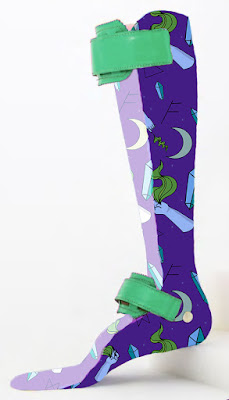
Crispin Orthotics Mockups

I attempted to throw together some mockups of my pattern on orthotic splints. 
These are definitely not the greatest, doing mockups is hard but I do think it does give at least a vague idea of how this pattern would look on a real item, and if nothing else has given me some more experience creating mockups. 


Friday 8 April 2016

Jeremy Kyle

Another idea I had was to do some Jeremy Kyle related things as the drama of Greek Mythology could easily be turned into, or applied to an already existing Jeremy Kyle headline.

I drew the people, poses and headlines from a few episodes of Jeremy Kyle to get some references on how the stage is laid out, facial expressions, quotes etc.

In the crit before easter we discussed what on earth I'm doing because I keep getting really lost in the ideas of this project, I had lots of different ideas for modern scenarios to put these Gods in and no idea which idea to go with. They suggested just doing a compilation of them all, Jeremy Kyle related ones being one of them.

I didn't end up actually doing anything with this but I wish I had, because I thought that it would be really funny, and would give me an excuse to watch loads of Jeremy Kyle.

Thursday 7 April 2016

Crispin Orthotics - Pattern


I took this as an opportunity to do a pattern that I thought would look cool. I feel like this would appeal to a younger adult audience, perhaps 18 - 30 range. I just wanted to do a spooky witchy pattern with crystals, magic and runes etc. 

I did the lines for this using illustrator, to get a smooth finish and because I wanted to practise using illustrator. It was a challenge drawing the hands, as I did it using the pen tool but I think in the end it came out pretty alright - it might be worth looking into using illustrator more often for line work. 

I'm happy with the pattern I've made, I think it's fun. I would have liked to have done another pattern to submit, but with all the other stuff I've got to do I just didn't find the time to do another.