Sunday 30 November 2014

One Week Book - Screenprinting & Final outcome!

Positives ready for screenprinting! I have never done positives by hand, only digitally so this was a new experience for me. It was honestly nervewracking trying to make sure everything aligned properly and using a lightbox was a first too!


Add caption


Mixing our screen printing colours! Initially we had decided on a muddy lilac colour but when we mixed this more berry coloured purple we all really liked it with the yellow so we decided to stick with it. I am a pro at mixing mustard yellow.

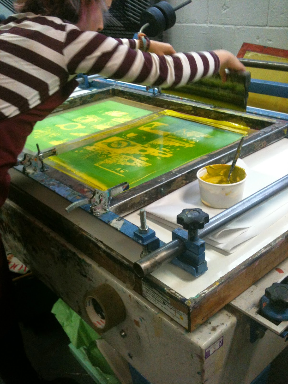
screen prepping madness
Each of us took it in turns to pull prints, we didn't decide on a set amount each; I wanted to do a few extra incase some went wrong. We had a little trouble with the right corner of our screen, on some of the prints it wasn't coming out (no matter who was pulling it) eventually we ended up adjusting the screen bed a little.

Once the first colour was on it was really exciting! Screen printing is such a fun process, whenever I do it I just want to keep screenprinting everything forever. The second colour going on was a glorious moment as the whole image just came together. Our layers registered pretty well so there was nothing was terribly disjointed, also since the purple was more of a pink tone the overlap colour was orange-ey instead of a muddy brown which was a nice surprise!


Screen stripping gear. Health and safety is heavy duty at Blenheim walk but at least I didn't blow the fuse on the jetwash this time. 


We tried to keep elements of the library in our imagery such as the stairs, arches and books lying about. I actually really like how the stairs pages have turned out, each being the same layout but with elements added in the arch/ on the sofa. This simplified layout really helped to tell the story more clearly than when every page was drastically different. I feel like maybe we should have spent a little more time on ideas, as we came up with an idea and since we all liked it we just went with it - it may have been helpful to weigh up some more different ideas for comparison.

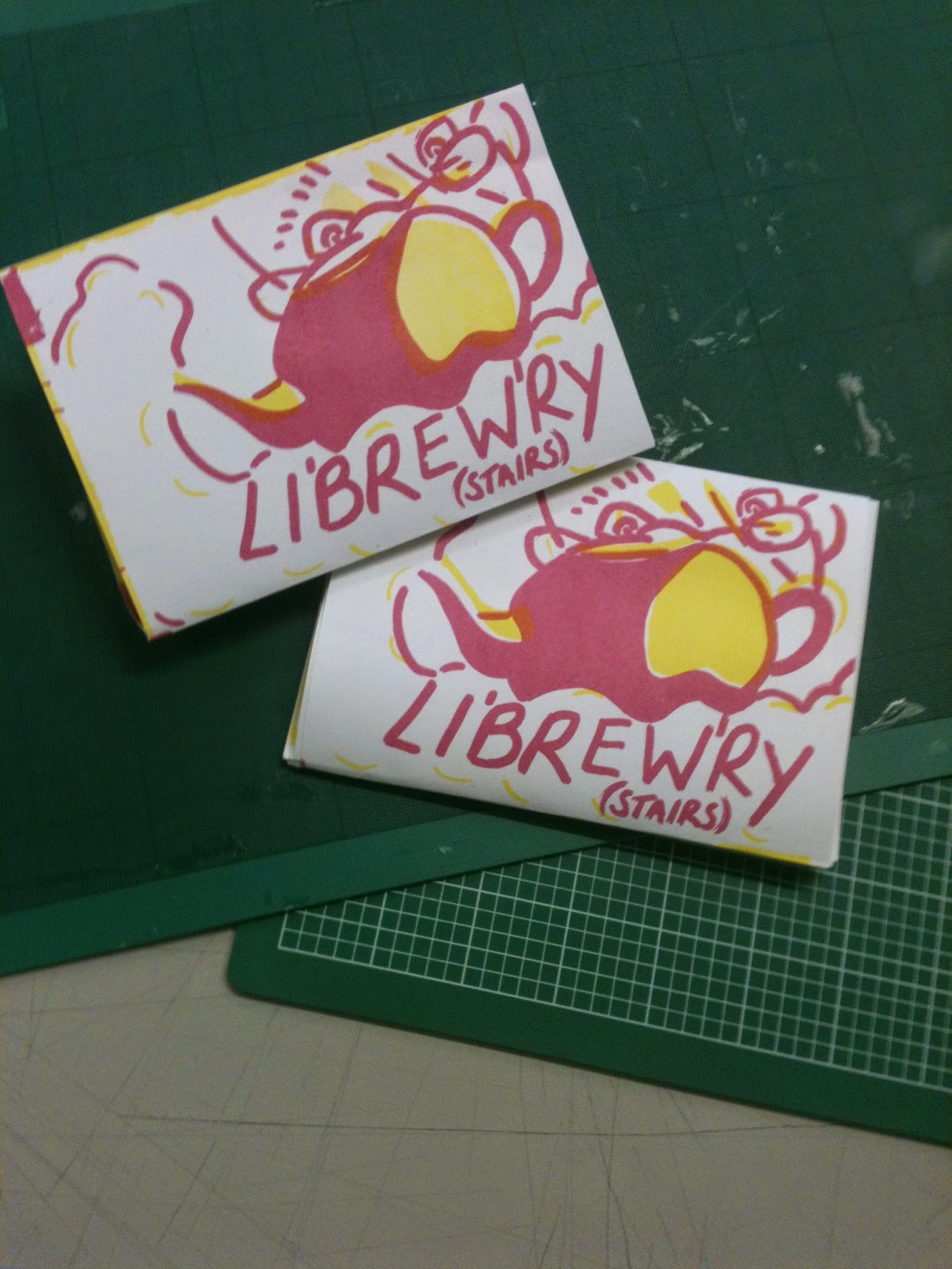
I am not good at folding.


Saturday 29 November 2014

One Week Book - Development

Our story was a bit crazy. We need to make the imagery clearer so the story is a bit more understandable. Matt suggested stairs running through the book so it's the same layout of stairs on each page. 
we thought about doing opposite stairs to give the impression of a labyrinth of never ending stairs but in the end decided to stick with stairs going in the same direction. (we were thinking of how a spiral staircase would look - we paid a lot of attention to the architecture of this teapot)
We had to consider what would translate into screenprint as something too complex might not work and theres more of a chance of the layers looking terrible if they register wrong. 


drew loads of stairs before I remembered the scene I was drawing only actually had stairs in the corner (oops) but it was all part of the group creative process to figure out what would work best. 


Added some text to my image 'shit me back' and 'where's me stick' to make it clear to an impartial audience that the subject of this story is an elderly man. 

I had a bit of a struggle with the stairs because I found when fully purple the stairs looked clunky on the page, like it didn't fit and I didn't want them to overpower the swamp and man. I tested different ways of filling them in, they all looked a little odd but I found the ones filling in less of the stairs were more complimentary. 

 I was worried about the colours overlaying because yellow and purple being contrasting would make a totally disgusting colour so everything would need to line up perfectly.


the struggle to find something blacker than black to make the positives with! I used Sam's black paint pen in the end but I tried all manner of permanent markers and all of them came out grey-ish. I didn't trust them one bit. 


Thursday 27 November 2014

One Week Book - Ideas!


We were feeling pretty productive at lunchtime - we made a mind map of our experiences and ideas. 


Emily was really drawn to using purple and brown as the colours as purple suggests the royal aspects of the library in contrast with the brown boring/old bits of the place. I kept noticing the colours purple and brown around the library too - all the stands were purple and loads of people were wearing purple jackets. It was a little creepy.

We all liked the idea of including the teapot swamp so we tried to mix a more swampy yellow colour rather than brown - I think the colours we came up with are successful but I used a yellow and purple colour scheme in a previous brief so I'm a little worried I'll fall into a pit of always using those colours. 


I made a tiny hot dog book so we could have a look at our ideas in action. The book would be about a man's adventure through the library swamp teapot. I felt a little like I was just bombarding my group with my ideas and I didn't want to overrule everyone so I kept checking with everyone to make sure they weren't just going along with what I said and not actually liking it. I am not accustomed to taking charge in a group so it was a weird experience.  The main idea I liked was the book opening backwards so you read up through the pages rather than down or left to right. 

The ideas we had were much more surreal than other people in the class - I think we all became a bit insecure about it. But in the end we got good feedback for going a bit wild with it - we were a bit too solid in our 'story' though & it was suggested we delve deeper into it. 
Sketch of my original panel before we altered our ideas - though mine was pretty similar. Trying to keep aspects of the library - the arches and stairs evident in the imagery. 


Wednesday 26 November 2014

Visual Narratives - One Week Book

Working in a group of six to create a screen printed hot dog book based off a location in Leeds.

The City Library

Started off just exploring the Library - drawing and taking photos. I found the place just like a never-ending labyrinth of stairs, arches and corridors. Very decorative.

I'm glad I took photos as all my drawings were very rough as I didn't want to put too much detail into it - just suggest the shapes and structure of the buildings.


 I do wish that I had done some more detailed studies as well as these simple ones!


The first thing we saw when we walked in were these massive pipes in a creepy little room.


As you can see - Lots of stairs. 


 I found the juxtaposition between the library and the arts section very odd. Everything was ornate and suddenly there's just this grey room!


All the doors look really mysterious like anything could be behind them.


 Emily was really feeling purple and brown for our colour scheme and I kept noticing bits of the library were purple and brown like this shelf.


We stopped for tea to talk about what each of us had done and ideas etc. We got more inspiration from the mess that we found inside the teapot - thus formed the teapot swamp.


In the cafe we noticed there were loads of old people around and we wanted to include that in our book. 
Some of the experiences people had were -
  •  a big burly man looking at Justin Bieber's biography
  • a man going up the stairs saying "twats... it's unbelievable what a shit hole this place is"
  • A man asked me where the internet was. 


Friday 21 November 2014

Photography Induction

Fast shutter speed


Fast Shutter Speed

Long exposure.


Shallow Depth of Field