Friday, 30 October 2015

After Effects Notes

Session 1:

Session 2:
Keyboard Shortcuts:
p- position
a- anchor point
r - rotation
s- scale
t - opacity
Shift + Shortcut adds it to the 'list'

o - moves time marker to the outpoint of the layer.
i - moves time marker to the in point of the layer.
b- moves the beginning of the work area to your time marker
n - moves the end of the work area

u - reveals animated properties of the layer
uu - reveals all changed states


Hold Alt while moving all key frames moves em all relative 2 each otha

Photoshop


<iframe src="https://player.vimeo.com/video/143717803" width="500" height="274" frameborder="0" webkitallowfullscreen mozallowfullscreen allowfullscreen></iframe> <p><a href="https://vimeo.com/143717803">Best Video Evarrrrr</a> from <a href="https://vimeo.com/user45220925">Amber Kaplan</a> on <a href="https://vimeo.com">Vimeo</a>.</p>


Session 3:


Importing a layered file as footage - there will be the option to merge the layers or choose a layer from the file. 

Import a layered file as a composition / composition - retain layer sizes. 

Double clicking the composition brings it all up in AE rather than having to move each layer in separately. (CHECK THE PRESETS)

Importing a file with many layers will crop the size of each layer to the size of the AE composition. 

Anchor points - Importing a file as composition, the anchor point is central, all the items move around the same anchor point

Importing file as composition - retain layer sizes, each layer has it's own anchor point as each layer is the size of whats on that layer. 

It's probably best to retain layer sizes as it is likely it won't be helpful to animate separate items around a common anchor point. 

Keep your after effects project in the same folder as your assets, or AE will lose track of your files and get a lil' wild.  If you lose your file the layer will still be there but full of coloured stripes. Right click - replace footage & add the file.


keep yo sh*t together 

- Shy switch allows u to hide layers from your timeline when your composition gets too complex, only comes into effect when you select the master switch at the top. 

- for comp layer, keeps ur vectors vecty - smooth edges to infinity and beyond

- Temporarily lower the quality 

-Motion Blur - can help to simulate an effect that looks more realistic, movement, change of scale etc. 

- Adjustment Layer 

- Fx switch temporarily turns off effects (for previewing and stuff) 


Tuesday, 27 October 2015

Storyboarding Workshop

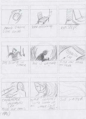
In this task we had to choose one of the images we had brought and make a 9 panel storyboard from it, the image had to be the 5th panel so it was in the middle. 


As the image was in the middle I thought it was pretty hard to think how to get to that image and then away from it again as I had to think of story each way. 


I ended up massively overcomplicating the whole thing by trying to create stories rather than focusing on getting to this image and to a blank end. It could have been as simple as the character walks in, sits down, writes and walks off again. 

This task has given me some perspective about the final animation as a whole, especially that keeping things simple isn't lazy - it's necessary. Overcomplicating things will just lead to total disaster, and adding information/noise that is completely unneeded. 

Also 15 seconds isn't actually that long, so attempting really complex 'storylines' is not in my best interests, as I'd probably waste time trying to come up with a big idea rather than smaller, simpler ideas that can be combined into a final resolution.

Sunday, 25 October 2015

About the Author: Visual Journal IIII

I bought a black sketchbook as I thought that working in white and colour on top of black would give a different vibe. Using a black background gives an impending sense of gloom and darkness and a very gothic vibe to the work. (Somewhat inspired by Emily Carroll's work being against black backgrounds). Plus it really makes the colours pop. 

Above are some sketches I did again investigating incorporating a skull into a dress instead of onto the face. I quite like how the one on the left looks as the character is in a relaxed pose, so it's more like she's been marked for death (perhaps with illness) but is not dead. It could still be subtler but it's less upfront than straight up having a skull face.


Some cat skulls. Drawn a lot of human skulls, and a lot of cats, but not any cat skulls. Links to the story The Black Cat and suggests death as a whole. 


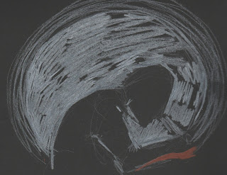
I liked the idea of working with silhouettes, here a silhouette of Poe writing is illuminated by a light (intended to be candlelight) - I think this could nicely be translated into animation, with the light flickering like a candle.


This is metaphorical, nobody's face melts but a lot of beautiful women die in the stories (and in Poe's life). Usually they were loved so I thought imagery of a face being caressed but also melting off into a skull would translate the horror of loved ones dying prematurely. I'm sort of toying with an idea of seeing things in a first person perspective, as if you were a character or Poe himself. So the hands here are meant to be like a POV.

Thursday, 22 October 2015

About the Author: Progress Crit: Self Evaluation

What do you think works well

I honestly think that the cliche work I've been doing involving women with skulls faces and red and black colour schemes work well, because as cliche as they are they reflect the themes and feeling of Poe's work.

How will you capitalise on this?

I will push these ideas further. I am worried I have got stuck in a rut of just drawing women with skull faces so I am going to take the themes and motifs I have identified (skulls, ravens, cats etc) and find different ways of presenting them to make them different to what has been done before.

What do you think could be improved? & How will you benefit from this?

The quality of my work could be improved - as in I should spend more time on making some really good refined pieces of work. This would benefit me as I'd be able to see exactly what I want to do better, as trying to decipher a final direction from initial scribbling isn't the best idea. It has never served me well - with more refined work it will be easier to show others what I want to do as well as I may be able to decode a sketch but others might not.
Also thinking ahead to what I might like to do in print so I can plan imagery accordingly, as things that are doable with digital print or screen print would not translate into lino or mono print well and vice versa. Though the print workshops will probably inform this more.

What would you do differently next time?

I'm not sure as I think what I've been doing so far has been fairly successful. Obviously I would take some more time to do refined pieces, but I still have time to do that. I might have explored brainstorming more, as I tried to do this to break away from the obvious but I always failed or ended up in a circle of brainstorms where nothing was new and everything linked together.
I would try and stop myself getting into a rut, as I have drawn about 5000 women with skull faces, I should get out of this fixation or at least develop it into something more exciting.

What would you achieve from this? 

It may have aided ideas generation and given me a wider breadth of development in this initial stage of the project, but as I have identified this although late I can try and do this as I go along. My work and ideas will develop, because I will make it so.

What have you learned by responding to this brief & why is it important?

1. Sometimes cliche's are good! - Obviously you have to have originality to it  but I don't think there's any point taking something so far from the source material if you definitely want it recognisable as that thing. (And be wise with your cliche's you don't want to over-do it)

2. Visual metaphors and motifs - This is important because some symbols such as skulls or love hearts are (pretty much) universal and can really explain the meanings or themes behind images without you having to say anything about it. Makes the work speak for itself.

3. Process informing imagery - Keeping in mind I do not especially want to use digital print so things I have been doing so far may or may not be appropriate for other formats of print.

What have you gained from the Peer feedback session?

What I've done so far shows that I am enthusiastic about my Author
I should look more at Poe's life and try and include it alongside the fiction
I've heard you can use a mixture of the print processes, or print and then work into it as well - this has given me thoughts about lino or mono print textures.
Inspired me to try different techniques - collage, drawing onto textures, finding shapes within brusho backgrounds or textures, using more shape. 


About The Author - Peer Progress Crit

Peer Feedback

Comment on the breadth of initial ideas produced in response to the brief:

Strengths

  • good amount of work, lots of drawings
  • really thrown self into the project
  • identified prolific themes throughout the work & responding to them
Suggestions
  • DO EVEN MORE
  • Stay away from pencil and ink for a while - go straight in with gouache or acrylic or something. 
  • Do more work without outlines or sketches
  • Make marks & Textures


Comment on the visual investigation and development of ideas in response to the brief:

Strengths

  • Have investigated different paths (looking at illustrating stories as well as themes, combining the two etc)
  • Development is looking good
  • Have investigated themes within the work and developed different drawings from there
  • Tried branching out from the cliche but also justifies use of cliche motifs and colour schemes

Suggestions


  • Again DO MORE
  • Try and do simpler stuff, don't over complicate things
  • Merge stories and themes more
  • Include more about the author's life - research and draw tuberculosis in its different stages. 


Comment on the visual quality of the work in progress:

Strengths


  • It's ok
  • A lot of sketchy stuff
  • Some nice media experimentation

Suggestions


  • Needs some more media experimentation
  • Refine work a bit more
  • Spend some time on doing larger more refined pieces, based on already done drawings (Like what Emily has done)
  • Thinking ahead to final process - a combination of mono print and lino print would be appropriate as it would give some spooky textures that reflect Poe's work. 

Comment on the effectiveness of the work in progress in response to the set problem:

Strengths


  • Capturing the feeling of Edgar Allan Poe's work
  • Using consistent Motif's and imagery that work in response to the author
  • There is potential 

Suggestions


  • Narrow it down to select motifs
  • Keep experimenting
  • Keep in mind the end process and making appropriate imagery for it (fiddly line stuff in lino would be a pain in the neck) 

Wednesday, 21 October 2015

Print Notes

colour libraries - pantones


Spot colour channels


Using tints instead of different channels:

Use a grey instead of black to fill in the lighter areas, use black on the same channel layer for the darker shades. 


*Frequency 50 - 60 cos ya need a sweet halftone. 


Tuesday, 20 October 2015

About the Author: Visual Journal III


 In Poe's stories such as 'The Black Cat' and 'The Tell Tale Heart' guilt and paranoia is an important theme, that usually leads to the main characters undoing. Poe himself was also very paranoid in the last years of his life, constantly thinking people were after him to the point he had a friend shave his moustache so that no one would recognise him.

I started thinking about how guilt would be portrayed as it's an internal feeling.

One idea was a man looking in a mirror, his reflection showing his face covered in blood - with a knowing expression, as guilt is a personal thing this sort of gives the 'you know what you did' feeling.

Another idea was a face surrounded my eyes all looking in at them - suggesting paranoia of everyone else knowing what they've done.

A few classmates have said they really like this so I think I will push the 'judging eye' motif forward. - It also relates to the stories of The Tell Tale Heart and The Black Cat as the 'victims' have something going on with their eyes (The old man has a glossed over blue eyes and the cat has one eye cut out)

(I have also been wondering how I could incorporate a skull motif onto a woman without it being directly on the face, I like the idea of putting it on the skirt as it could easily be disguised as folds to be more subtle)

I just like drawing women so I wondered if there were a way I could incorporate some of the themes into one image, including the judging eyes on the skirt - guilt/paranoia. The skull in her hands & general ghostly presence - Death. (also a little Raven skull just for whimsy). I like how this looks and would like to do a proper painted version of it, but I'm also unsure if it's appropriate, but I think the idea of incorporating something within the shape of something else could be successful. 


Saturday, 10 October 2015

About the Author: After Effects Video


While looking on vimeo for after effects videos I found this video. The whole video is really well designed and professionally done, and shows some really quality skills in making things in after effects. Though I definitely won't be making anything of this calibre, I think it's incredible to see what can be done with after effects, as I am not sure I would be able to do anything other than simple movements. I enjoy this video though, its fun and a good example of how audio has driven the piece (as the animation was made for the audio) rather than the audio track just being a second thought, added in for effect! 


After Effects | Shape Layer Fun from Marcel Sygula on Vimeo.
This is a bit of a simpler video, I think the creator just made it to experiment with shapes. Still really smooth animation, and great sound effects. Although it looks simple I'm not really sure that this would actually be "simple" to do as there are some more complex bits (the shape turning into a rocketship), but it sort of makes me a little excited to have a go with after effects!

Wednesday, 7 October 2015

About the Author - Artist Inspiration - Emily Carroll

 Emily Carroll brought out a book of tales that she wrote and illustrated called "Through The Woods". I have this and have read it and can confirm it is the most terrifying thing I have ever read. It's like a graphic novel of folk tales.


The illustrations are really beautiful but also deeply unsettling. The panelling and zooming on certain sections really creates atmosphere and tension within the story. 

In the pages below I love how the text leads the viewer through the panels, and also through the characters walk through the house. The fact that it is bright red against these calm blues, dominates the page. The textures on the ends of the red makes it look kind of liquid, like blood. All the elements create a scary atmosphere. 


I really like the use of black backgrounds and borders instead of white because it gives the impending sense of doom and darkness. 

Carroll's style is adaptable but recognisable - she has done this terrifying graphic novel but also does more lighthearted drawings such as these faun's below!!

This has given me a bit of a confidence boost that just because my go to "style" is cartoon-like doesn't mean is has to be funny or lighthearted, it can be scary and macabre without having to change my whole way of working. 

About the Author - Visual Journal II


"all my soul within me burning" 

 To break away from the style I favour - with many outlines I have done some ink silhouettes, which I really like the look of. I used quink because I love how it makes a bunch of funky colours when you water it down. (Though this wouldn't be good for a two colour brief, I think it's fine for a play). In this last image of the cat (Based on Poe's "The Black Cat") I have added the detail of the eye with coloured pencil over the top - as the cat's one eye is a big part of the story. These images definitely show the dark atmosphere of Poe's work, and I love the simplicity of them, though I am still tempted to combine this technique with lines on top too.

 I've slipped back into the pit of red and black but I think for these images it works quite well. The first image although not explicitly showing anything suggests the fate of the character in "Never bet the Devil Your Head",  the second image is more obvious.


 These are not greatly done, I just wanted to slam down the idea. For the Tell Tale Heart and The Black cat I think this layout, the image being incapsulated in the head gives a suggestion of the guilt of the character. It's pretty simple, I'm not sure how I feel about it, half of me thinks something simple could be really effective but then half of me just wants to make stuff as intricate as possible. Can I blend simplicity and intricacy successfully?

The pendulum just looks like bad Bane fan art, totally wrong.

About the Author - Visual Journal


I had made a few pages of scratchy textures which I thought matched the overall tone of Poe's work so I decided to work over them. The first I'm not too keen on, it was one of those things where I had the idea in my head but I couldn't translate it to the page right. Though I do really like the hair, I've been enjoying drawing hair with a lot of lines recently - I think it looks really cool. I prefer the second drawing though it's also not what I envisioned, but it looks nice. The colours were chosen because I was trying to break away from doing everything black and red.


Some more stuff based on 'The Raven" trying out different colours. Although I do like the purple's and blues if I were to use these colours I would have to narrow it down as the end product has to be two colours and these are much more than two. Keeping this in mind although it's predictable, using red and black would fit into the brief and be appropriate colours. I will keep experimenting, I don't want to limit myself just yet.


Thinking about how I can mix up motif's - skull representing death but the bottom jaw is the Pendulum (The Pit & The Pendulum). - Expanding on this could work well, as it links directly to a story as well as recurring themes throughout. 


Although in "Never Bet the Devil your Head" there is no demonic representation of the Devil, I thought I'd throw this out there - This image sort of bridges into comedy though and that's not really where I want to take this. I have a 'cartoony' way of working, which I'd like to break out of because it's my comfort zone and stuff but also I'm worried this style will resign me to humour? Though I've seen other artists such as Emily Carroll have a 'cartoon-like' style and pull off horror very well (Through the Woods is terrifying, I would never read it before bed) 


Poe's head on the Raven, I am self sabotaging by saying I want to break away from humour and then drawing this. 

Long story short: I really want to explore everything I can with this brief, it's long and there's plenty of time for me to do LOTS. Right now I don't need to have an existential crisis about my work.