Saturday, 28 November 2015

About The Author: The Raven (2011)


I watched this film on a whim and it was actually very enjoyable! Despite not being greatly biographical - obviously its not a documentary it's an action film meant to entertain, it did include certain biographical elements - that all the women in Poe's life had died and this had effected him, his drinking, and what has been implied of his general character - sass and confrontational with people he worked for. What slightly annoyed me is that after Poe's wife died he reunited with an old love of his, this could have been the love interest in the film instead of  a totally fictional thing.

I think the film really captured the feeling of a lot of Poe's work, and was a gripping mystery which gives a nod back to Poe basically being the father of detective stories. A lot of film adaptations of Poe's work were done many years ago and are either just funny - because they're basically B-Movie horrors, or completely changed from the source material. Though this is not an adaptation of his work there are snippets of his stories quite accurately presented.

Wednesday, 25 November 2015

About The Author: Lino

Based on the designs I've already done I have made some lino cuts! Some have turned out a lot trickier than others. I have realised that a lot of these would either have to be simplified or be reduction lino cuts as I wanted to use a couple of tones of the same colour. 
I really needed a much smaller lino cutter or to have done the one on the right much bigger so allow for the detail (even though there was only a small amount in the first place)


I am excited to print these and see how they come out. 

About the Author: Print Mockup

The change in tone has really stimulated me. I'm having a lot of ideas for the beer label route, as it's opened up possibilities to a different tone of work and PUNS! Looking back at a lot of the work I've done for this project so far, I'm starting to hate a lot of it. Now that I'm on a different track I can see how obvious everything I was doing actually was, and I'm not especially happy with the quality of anything I've done. However I am really enjoying making this new stuff. 


To go along with the theme my idea is to make a publication - a concertina book that is a mock beer guide, with the 'label' designs, and perhaps a short description of the 'beer' using quotes or themes from Poe's work instead of an actual description. Ideally I would like to do it double sided with a 'pattern' of bottles across the back, as I don't like the idea of leaving the back bare.

I am considering using screen print for this, although I will have to investigate this further and do some more tests involving half-tone and such. Ben suggested that lino may be appropriate too, so I will do more tests before making a full decision about what to do! Lino may be appropriate for image making but not for text so it could end up a combination of processes, if I make some good lino tests then I could use the imagery for  screen print positives or if time gets away from me, a digitally printed book. I am motivated and will definitely plan my time so I can get as much done as I need though.


About the Author: Post Crit Madness


After the peer review I got thinking about alcohol labels, as I put forward the idea of bottles having a story inside - which relates to Poe's alcoholism and it was suggested not to do bottles as someone else is already doing something similar, but to just focus on labels. 

I spent some time looking up various ye olde time alcohol bottles and novelty spooky parody ones, to give me an idea of what people have done here already. 


I stuck a lot of the images into my book so I could reference them. 
As part of this I looked at the Wychwood Brewery labels as all their products have spooky names and funky designs. 
Off the back of this I decided to design some images that looked like beer labels, based off Poe's work. I chose to use green on a whim, as I thought the feel of this should be more subtle - and the pale green still gives that eerie undertone without being upfront red+black = horror and such.


I really like how these turned out, I think the colours go really well and I feel like with green I can happily use different tones of the same colour and it still be "two colours"

About the Author: Screenprint Workshop

I love screenprinting! But at the time I didn't think any of the work I had done was appropriate for screenprint so since it was just for a workshop I cheated and threw some photographs I found online together. To make them suitable for sceenprint positives I used the "Threshold" option on the photographs.


I had been using red and black for almost everything so far and I was stuck in my way of thinking that that cliche colour scheme worked, but at this point I was pretty sick of it. Also I wanted to do something overlayable as the printing inks are translucent. Digitally making my positives allowed me  to see what the colours I chose would look like overlayed. I wanted to do the raven a colour that you would be able to see Poe's face through. In the end I decided on still using black, for Poe and overlaying a blue/green raven. 


I'm pretty happy with how this turned out and am thinking that this green/blue colour scheme works better than red and black. Also I dig how despite Poe being in black ink, the blue still changes the colour of it slightly! My printer was running out of ink when I printed the positives but I like the scratchy texture that gave. 


Tuesday, 24 November 2015

About the Author: Peer Review


These are some of the images I brought to the peer review, I felt like I didn't have a lot to show so I knocked some 'ideas' out pretty quickly - they're all of quite a poor quality. Along with my lino prints. 
At this point I am thinking of doing a series of prints but I haven't really got any idea of what I want to do with them. The only idea I has was things within things, like those hidden painting type images - or more detailed stuff within a simple shape something like that?

These aren't very good but I like how the ink drawings are looking, they have a quality that could easily encapsulate hidden images within a shape. I don't really know what I'm doing, I need to find an idea and explore it more. In the crit I've been given some ideas about looking at playing cards.

I put forward some ideas about bottles because of Poe's alcoholism, that got some positive feedback.

I'm not feeling great right now because I'm so unsure of everything, once I find something to stick with I'm sure things will pick up. 


Monday, 23 November 2015

About the Author - Music Insp.


This songs lyrics are comprised almost entirely of Edgar Allan Poe's writing. I have listened to this maybe 100000000 times since starting this project cause it just gets me in the Poe mood. If the narration at the beginning were only 15 seconds long I would definitely nab it for my sting. (Though as what I want to do also includes the silhouette of the author, it's good that the sound is not that length or my sting could almost definitely go down for plagiarism) ANYWAY. I really love the tone of the video - colour schemes and atmosphere and such.

Maybe for my sting I can use different narrations of Edgar Allan Poe works - most audiobooks of his work are public domain.

Tuesday, 17 November 2015

Lino & monoprint

< my scanner has wacked out the colour of everything so excuse these images I will update them with something better>

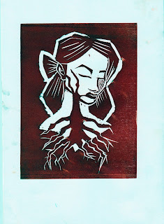
I quite enjoyed lino printing. I didn't have a plan for what I would do I just went in and did it though I really like whats come of this. (I know roughing is important for a lot of things but some of my best work has come from just going into something without planning). I've never really enjoyed lino printing before - the process is long and I'm not great at making things neat and precise no matter how hard I try - but I enjoyed it this time and I think I would really like to pursue it further as then I can explore and experiment with this technique. 

<insert more mono print scans here>

Monoprinting I think I would like to try more of. I didn't really make anything I liked so much but I can appreciate all the funky textures and stuff you can make using mono print. I wish I had done more prints adding things onto the plate and printing it rather than drawing on the back of paper so I could experiment with stuff using photoshop, but I just drew loads of creepy hearts for the tell tale heart. 

I've not made a decision on what print medium I want to use for my final images yet. I think I will have to do experiments with them all again to really decide but I'm thinking a mixture of mono print and lino print would be cool.