Sunday, 18 December 2016

Sex Work Exhibition Final Images


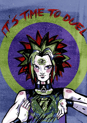
* decided to use the same leg layout to give a sense of unity to the pieces.

* red as an accent colour - motif for the international day to end violence against sex workers

* happy with textures, think It's definitely a defining factor in my practice these days

* little bit rushed, finished these in one day. Lot's of people like them but they could have been more refined.

*some details get lost in the dark colours of the background

*colour scheme matches the tone of the imagery & the darkness of the subject

* THE FEET ARE ANNOYING ME SO MUCH, I can't draw feet. They're so small.

I enjoyed doing this project, it was something a little outside of my comfort zone as it dealt with a real serious issue rather than an obscure pop culture reference. I think it was definitely a good exercise in transferring my tone of voice into different areas, as this is something that needed to be dealt with sensitively and could have gone horribly wrong as my tone of voice can be pretty weird at times.

Another time management problem : I needed to get them printed, and couldn't go to drop in or drop off because the digital print room was closed that day!!! So I had to look outside the college, luckily Colour Copy was an absolute saving grace and I could get the images printed A3 at a reasonable price on an appropriate stock.


Here is a not-so-great picture of my prints displayed in the exhibition, which was held in a downstairs section of Hyde Park Book Club. There was even a red umbrella there so my pieces related in context to the rest of the show which was pretty awesome! The girl who set up the exhibition commented on the umbrellas, noting it was either a weird coincidence or I'd done my research on the topic. (I had done my research)


Thursday, 15 December 2016

Final Logo. BB.


The final logo I made for this singer was admittedly not my best work, however she really liked it so that puts my worries at bay. In hindsight I was probably not the best person to do this, a graphic designer or someone more skilled with type would be a better fit.

on the plus side I was able to gain some more skills in photoshop, creating custom brushes. As well as practicing liaising with clients, receiving feedback, having an ongoing narrative with somebody about the work etc.

I should have researched typography properly instead of just free-styling based on knowledge I already had about type, which was not a lot.. but I can just about write.

I have learned that this is probably not my calling in life, but would still like to do some music related things, just logo's are not for me. - (album art, posters, collaborating with a graphic designer etc).

She did ask me a few weeks later if I could do some more of this and I had to turn her down because I  didn't have enough time with my dissertation going on too and I knew I would not be happy with the work I created.

Thursday, 1 December 2016

Logo - Development, leading up to final images

The process of 'developing' this.

The first two images are some of the sketches I did to send over to the singer, she replied with feedback that she thought they were looking a little harsh and she wanted something softer to match her tone of her music, but they were getting there.

I feel like I haven't been the best with this project because I'm not great at typography, but thought I should give it a shot. The client seemed happy with what I was doing, and I think working with someone who's been able to give me feedback has been helpful and productive for my professional practice, communicating with a real human client and such.

I struggled juggling doing this along with my dissertation as the client needed the image before the end of December. I would have liked to have spent more time on it, maybe I could have made something that I was happier with.

Wednesday, 30 November 2016

Sex Work Exhibition : Sketchb00k Development


* my first idea was focusing around violence towards sex workers, I wanted to be respectful but not shy away from the fact that violence towards sex workers is horrific and brutal. I researched prominent instances of this and thought about something to do with the people who commit acts of violence against sex workers (the first image being a mugshot of the man who killed a sex worker in Leeds). I decided against this pretty quickly as it focused attention away from the sex workers themselves.

* A bit of research led me to find that a symbol associated with violence against sex workers is a red umbrella, so I wanted to use this as a running theme throughout the pieces. (The exhibition was part of a series of events for the International Day to End Violence against Sex Workers)

* I wanted to explore different kinds of sex work, as most people think immediately of prostitution but sex work can include stripping, online cam work, porn etc. and sex workers can be treated violently in any sector of sex work.

* Started sketching out 'scenes' that would include the red umbrella, ranging different kinds of violence, or just scenes of people walking down streets holding a red umbrella.

* I asked a couple of people about their views on how to depict the violence, as  didn't want to just draw it happening & I wanted to keep things respectful. These people said that they believe other sex workers would not want the violence sugar-coated even though it is really violent - to communicate the severity.

* I found a quote from a trial which was " whatever work they did, no one is entitled to do these women any harm, let alone kill them" which I found really powerful as it communicated exactly what I wanted to through the work.

Friday, 25 November 2016

Talenthouse - Space


I only ended up making 3 pieces for the space instead of the intended 5.

I used this as an opportunity to play with digital media a bit more after really enjoying it with the Travelling Man Brief.

Is this suitable for social media? One of the specifications was that the images be suitable to be shared on social media, which is perhaps where  I fell down by including an exposed nipple. Personally as the images are not sexual, and just show a simple drawn nipple that I would consider them fine to be shared on social media. We have to break the boundaries, smash the societal norms that say a female nipple cannot be shown. 

Overall I'm happy with the look of these pieces, I think they work together cohesively and I enjoy looking at them. I could definitely adapt them to put on products as well! I'm finding ways of being more comfortable working with a mixture of traditional and digital media, and really shaping my tone of voice. 


Thursday, 24 November 2016

Sex Work Exhibition - Research


I have been researching into violence against sex workers and it is absolutely horrible, as you may figure. 

Here's a chart o what's going on, from wikipedia.


It's pretty horrific that sex workers have been the targets of attacks for, like ever. Serial killers targetting them throughout history, and client violence as well.

I also found that the red umbrella is a symbol for the international day to end violence against sex workers, which is the 17th December.

[pics]

Tuesday, 8 November 2016

Sex Work Exhibition


The Charity ‘Basis Yorkshire’ are asking for artwork around the topic of ‘sex work’. I thought this would be appropriate to my practice as I am a feminist and sex work is an important topic within feminist discourse. 

I am aware that there are lots of different kinds of sex work (not just limited to prostitution. There's all sorts of sex work) and the charity wants the brief to be open so artists can put their own views on sex work into the images. I definitely don’t want to make anything that could be seen as offensive to sex workers because that’s not what I’m about – I support sex workers and their right to be safe and this is what I want to communicate in my work. There are no restrictions on media so it’s very open. As of right now I don't know what aspect of sex work I want to address in my art, though I think that the exhibition is for  December 17th which is  the International Day to End Violence Against Sex Workers, so maybe looking at violence against sex workers would be appropriate - as it would draw attention to the issues faced by many sex workers. 


About the Charity: 
Basis Yorkshire's Sex Work Project offers support for women involved in sex work, including advice on sexual health, the law, support for migrant workers & personal safety. 

(Some screenshots from their website http://basisyorkshire.org.uk/sex-work-project/)


Friday, 4 November 2016

Travelling Man - FINAL IMAGES!!!


Here they are, the final 3 images - two of which will be displayed in Travelling Man!
I had loads of fun doing this brief as it was fast-paced and just something I could really enjoy doing.

I think this is some of the more successful digital work I've done, a majority of the drawing was done in illustrator and photoshop with only traditional textures added in - which I think just give something more to the image and kind of imply my tone of voice. I had been doing a lot of paper cut over summer and wanted to find different ways of creating the same tone of voice, I think this digital experiment really worked and has definitely helped me find methods and work that I enjoy doing. 

Working with the colour palette was a challenge but a challenge that I embraced, it was really fun playing with settings and digital techniques to make the set of colours work. I've made three pieces that clearly fit together as part of a set, using the same palette and they don't all look the same, there's nice continuity. I'm happy with what I've made and I'm excited to make more work!

Tutorial wi That Ben 4 // 11 // 16

Y3 BOI
Positive vibes all round from our lad Ben.

He thinks my work is looking more me, and he's right. I'm much happier with what I'm doing and what I'm making. I'm choosing projects that suit me and sacking off stuff I don't want to do so I don't end up making crap. 

I was feeling a bit sketchy about the fact I've only done quick briefs so far, this tutorial was re-assuring cause Ben was fine with what I'd been doing and encouraged me to just keep going.

He suggested I keep making work and then have a moment to review everything I've done and really refine a few favourite pieces. I just need to give myself time to refine, & it's not I'm doing small quick briefs, I'm doing bigger briefs but making them quick.

The Sex Work exhibition is going to be a challenge and he suggested I look at how other artists have depicted sex work, as it's got to be respectful and my work has a kind of 'brutal' edge to it. 

I was linked some useful surrealist artists for COP as well, as I'm doing about subverting the male gaze which I think will be useful as I'm still struggling a bit with finding appropriate works for my case studies. 

FEELIN GOOD BOUT EVERYTHING. 

Travelling Man "Crit"

The day all the images are in to me and Jack the tutors assembled us and gave us critiques.This was helpful as we were all able to improve our images and we could get some fresh eyes on the pieces, but it was 2 hours before we had to get them printed so it was a bit of a rush to do the final bits on time - as well as organising everyone getting their final final final images back to us!


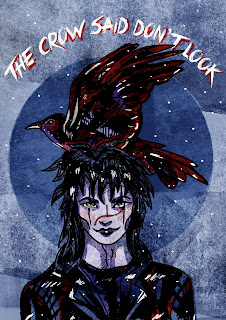
 This is what I had initially, a lot of people had told me they really liked The Crow piece and though I wanted to submit my Yu-Gi-Oh one I thought it best to capitalise on the positive attention this piece was getting.

Ben told me to try the image without the text, and the dark blue circle, as the crow kind of disappeared into the dark blue. When I took off the circle I was left with a lighter shadow of it because I'd erased the shape from a different layer, which I thought was pretty cool cause it still had the halo element of the image. Taking the text off meant I could crop it in further, which did look good but I preferred it with text so I used my judgement on that and left it.

Someone ended up dropping out last minute too, so I was able to submit both The Crow and the Yu-Gi-Oh piece so leaving the text on meant the two images would look obviously like part of a set.


Thursday, 3 November 2016

INKTOBER [and how I bailed]

I had high hopes for myself in regards to inktober, I thought "an ink drawing every day how hard can it be". It's not hard per se but I found it just so uninspiring, especially when I got behind in it and tried to catch up. In the end I only managed to do 11 before bailing on this completely.

I used the 'official' words list - my first mistake. I struggled to come up with creative ideas for the words list. I feel like I should have set myself a theme like "these will all be mushrooms" or something like that and owned it from the beginning, but I didn't - I fell into my old pattern of flitting from idea to idea.

I thought I could do them all in lino, as that is still ink. I had a lot of fun doing lino pieces, but some pieces were better, and already my inktobers were inconsistent. I think for me, trying to do lino was biting off more than I could chew as I couldn't really do one a day unless due to the times the print room was free to print in so I would have ended up trying to do five prints in one day.

I found some processes that I like though - I enjoy lino and I liked using papercut textures and ink together, I thought they gave a really cool effect which reflected my tone of voice.

Again it kind of feels like I'm giving up on stuff too easily but I was just so uninspired by this project, and since it wasn't a live brief or anything I had no reason to keep going with it. I was making sub-par work and would rather give the time I dedicated to inktober to a more worthwhile brief.

Wednesday, 2 November 2016

Talenthouse - Create an image inspired by space

Talenthouse - Space

Create an image inspired by space. You can submit up to 10 pieces so me being me I am going to do a set of 5 space inspired ladies. This is pretty similar to my 'monster girls' project, but I just enjoy drawing ladies. 

The deadline is the 10th November so I have 8 days to get them done. I have already got one in the works and can bash these out fairly quickly so this is a short brief, I am just going to make the images freehand, minimal planning 

The images should be appropriate to be shared on social media

Deliverables: 5 Images inspired by space

Materials I intend to use: Digital drawing – photoshop and illustrator, with traditional textures.

Tuesday, 1 November 2016

Doing a Logo ??

A local singer approached me via my facebook page after being directed to me through Girls that Gig network. (I got permission from her to post some screenshots)

I was interested in doing this as I love music and sought out doing something to do with relating my practice to the music scene, though this was a Jazz singer - which is not usually the scene I am interested in, but I thought I would try it out anyway for the experience. 

It was the first time doing anything like this so I was a little apprehensive. 
The 'client' asked for a design that was mainly type - not my strongest suit, but it's all experience eh?

Monday, 31 October 2016

Travelling Man - Sketching Doing

I knew from the get go, I wanted to do a Yu-Gi-Oh piece because what other chance will I get to do Yu-Gi-Oh fan art for a brief? But then I kept thinking about The Crow and Sandman, two other comics I’m very much into. I decided it wouldn’t be too much of a struggle to make three images as a set, even though I could only submit one to the exhibition.

We basically only had two weeks to create images, have them printed and down at Travelling Man, so the heat was on. This was not the time for experimenting, this was a time for making, and that’s what I did. I really quickly sketched out some designs that had a format that was compositionally acceptable and would work as a set with all three characters.

When I made my Yu-Gi-Oh piece I accidentally made the canvas 420 cm x 594 cm instead of mm then wondered why it was going so slow. It’s because the canvas was nearly 6 metres tall. I did this entire piece in Photoshop including the linework, which may have been a mistake, I struggled with line quality and a lot of them are wobbly and took a lot of touching up to look good. The other two images I lined in Illustrator, which definitely helps with making smooth linework, I do worry that alone the lines look less organic as they’ve been ‘fixed’ by the program.


Even though I chose the colour scheme and liked it I will not lie working with those colours was a challenge, particularly the green and the lack of yellow. Though it allowed me to do a lot of playing around with different opacities and effects to make the images look the way I wanted. Having both the dark blue and the dark purple may have been a mistake that Jack and me should have probably chosen the colours more carefully but hey! I found myself wanting to use all the colours in each piece, as I made the Yu-Gi-Oh one first using all the colours, so I felt that the other two had to use all the colours to fit in well.

Using digital media meant I could mess around with colours and settings on layers to make things really weird. I actually liked the dark green background Yu-Gi-Oh but it was not meant to be. I was also able to add textures and stuff which is what I really like doing in my work lately!

The image I had most colour trouble with was The Crow cause it was all really dark, his hair's black, his coat's black, the bird is black, so I had to find ways to use the other colours so they didn't all blur together. I'd initially made the bird blue and black but as the hair was also that colour I started adding bits of red to bring it out from the dark mass.

The Sandman piece I had most trouble with colour ratio's - I forgot to take screenshots, oops. Making his cloak all floaty looking by adding patches of different colours everywhere eventually worked but it took ages to get the right amount of green to frame the character and not overpower the whole piece.


Saturday, 29 October 2016

Stardust - Final Images


I made my final image in a square format, mainly because the lino I had used was square. I was unsure about the dimensions of the work as the brief just said "no larger than A4 Landscape orientation" so I didn't know if that meant, make it A4 Landscape, or just any format that would fit within that frame. 

I tried cropping it to an A4 landscape format but I definitely still prefer the original square format as that fits all the information on the page, and doesn't have to cut off the circle. (I submitted both just in case).

I'm pretty happy with what I've made here, I feel like I'm really learning more about how to make work I want to make, and choosing projects that I'm engaged with! I really enjoyed this brief, I had a lot of fun and I feel like I have progressed a bit more with working with lino! I still have more work to do before I'll be really happy with my skills but practice makes perfect eh?

I think that my image is a pretty good representation of Stardust. It also leaves a lot of mystery to people who may be new to it, as big events and other characters remain unknown. There's just the suggestion that this female character has something to do with a jewel. 

I feel that the idea is simple and straight-forward but the imagery, colours etc is bold and I, personally just like looking at this. 


Wednesday, 26 October 2016

Stardust - Printing & Fiddling

I was just itching to do some lino printing so I decided to go for it here. I always intended to edit the print digitally so was going to print it in black but I decided life is more fun when you do lino prints in colour, so I tested out doing gradients! It was a lot of fun I really enjoyed the process, and the outcome - I definitely want to do more colourful prints in the future.

I think the prints look better in real life as you can see the colours better, but I love the combination of the luminous yellow and the blue/purple because it's like the night sky and the brightness of the star.

The image definitely needed some cleaning up so I had a play in photoshop, mainly experimenting with different settings and opacities, adding the ink textures and such. I started to dislike a lot of what I was doing here and preferred just the straight up prints. I think I found that I was overdoing the editing process, adding colours and textures and extra bits that didn't need to be there. Taking a step back and simplifying the modifications back down was what worked for this image.

Instead of adding anything, I just layered the two colours I had printed together and positioned them so the purple made up the lines and the yellow filled in the gaps, which definitely was less overpowering than everything else I was messing around with. I also made some touch ups on the shape of the face and smoothing out some mis-cut lines. More subtle changes than full on editing it.

At some point I thought the jewel in her hand was getting lost amongst the lines so I brought it out with a pop of a weird, turquoise. I tried to make it look glowing and magical to relate to the magic side of the story.

Travelling Man Brief!

After a few days of nagging everyone I know about whether this brief would be happening again this year, it was finally revealed. The brief is fairly straightforward, create a (family friendly) A2 poster to be displayed in Travelling Man, Leeds for Thought Bubble. There has to be 16 A2 prints altogether to fit in the 8 double-sided frames.

As I really wanted to do this brief, being a nerd, Jack and I took the reigns as leaders of the group.  We decided on a theme which was ‘Fan Art’, we wanted to keep this as open as possible so people could basically do what they wanted, and be self indulgent. We also chose a colour scheme by spinning round a colour wheel I have and seeing what colours it ended up on. They ended up being an odd mix of colours but I personally liked them and thought it would be interesting to see what could be done with a limited palette.


Since I had to vaguely organise things I made a lot of posts to gang and talked a lot with Jack about details via instagram. 


First thing we did was get everyone together so we could see who was interested. Initially 14 people came to the meeting but more were interested bringing our total up to 19. Jack and me decided that all 19 could submit work but we would then curate the show. 

The audience of this project would be the people who visit Travelling Man, and as the exhibition is in conjunction with Thought Bubble Festival the audience is likely to consist of people mainly interested in comics, and other such geeky stuff.