My poster is one of the works I am most pleased with. As I know I am not great at lining with a tablet I drew the linework out traditionally and then added colour in Photoshop. Using blue and yellow primarily - as that is the colour of the Ukrainian flag that Lesya is pictured holding in my poster. I am really happy with the how the colouring of her came out, I think it is well balanced in the two colours.
The bear was initially going to be white with just red accents so it didn't overpower the image but when I had done this it looked incomplete (I wish I'd screenshotted it now). I got feedback from my friends on what to do and they suggested colouring the bear a flat red - slightly more muted than the accent red. When I did this the whole image kind of just came together.
Overall I am happy with the poster but I did rush the background as I was trying to get it done by my print slot - if I had worked on it longer I definitely would have done more thinner sunbeams and probably in a slightly different colour as this shade is quite close to the yellow colour I used on Lesya's body. The circle framing the face and shoulder area really works though and draws focus to this - the sunbeams then leading you through the image.
The colours of the poster are a lot bolder than those of the postcards and stamps but I figured thats okay because the poster is meant to be big and eye-catching and powerful looking whereas the postcards do not need to have the same effect.
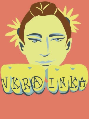
Although the colours of the postcards are more muted I am still sticking to the same colour schemes. I chose the muted reds as the background to show how Lesya defied the Russian Empire, and used several different tones of yellow and blue throughout each image to link it back to the Ukrainian flag.
I really like these because it was a more obscure way of presenting my person as she is from a completely different era from the punk movement but her spirit is much the same and is very relevant in modern Ukraine. In a way I wanted to present Lesya as a beacon of hope for modern day Ukrainians.
I created these in illustrator and for once in my life really enjoyed just working with shape - I've said once before but this inhibited me from falling back on line as a crutch, and I really love how these pictures have turned out!
 If I were to change one thing about these it would be to make all of the red backgrounds the same to unify all of them as they are all slightly different shades. Unfortunately I didn't think about this until I had already printed them.
I had invested a lot of time into my postcards and poster so for my stamps I wanted to do something simple. I decided on badges as they relate to the punk theme I pursued. They depict the name of her poem 'Hope', 'Glory Ukraine' In Ukrainian, The Ukrainian Trident and a sunflower which is the flower of Ukraine. Although I could have invested more time into these I think they are pretty cute - and as they are only small I feel that the images serve their purpose. As a standalone piece I'm not sure they make sense but when accompanied by the other elements they definitely tie in.


No comments:
Post a Comment