Friday, 31 March 2017

Monster Girls


With the use of some digital trickery I transformed this papercut torso into a full blown mermaid, with background. I think this whole project has really let me just play around with process - I've stockpiled loads of different textures for cutting and pasting, as well as scanning. 

I love having the ability to layer things up in photoshop as I think the added depth and texture is what gives me my unique tone of voice. I find myself increasingly happy with how things are turning out when I am working with mixed media - though I do struggle to tell when something is 'done' I mean is anything truly done? I think this image could have done with some neatening up around the tail - but I find that the textures and colours help to blend those little faults into the rest of the image so it's not such a big deal. 


I would have loved to have done a whole series of just different kinds of mermaid but since I'm now working on FMP and stuff the monster girls have sort of finished (for now, no doubt I'll be back on it as soon as I have a chance, cos I've got loads of ideas, and some monsters that didn't quite manage to get backgrounds yet)

I think I've definitely gotten more proficient in photoshop since doing this project as I've been able to experiment loads with different textures, drawing, editing etc and since I've enjoyed the subject I've made some really fulfilling work!

Tuesday, 28 March 2017

FMP - Foldin' & Openin'


After talking with ben I decided to just get real weird with it. 

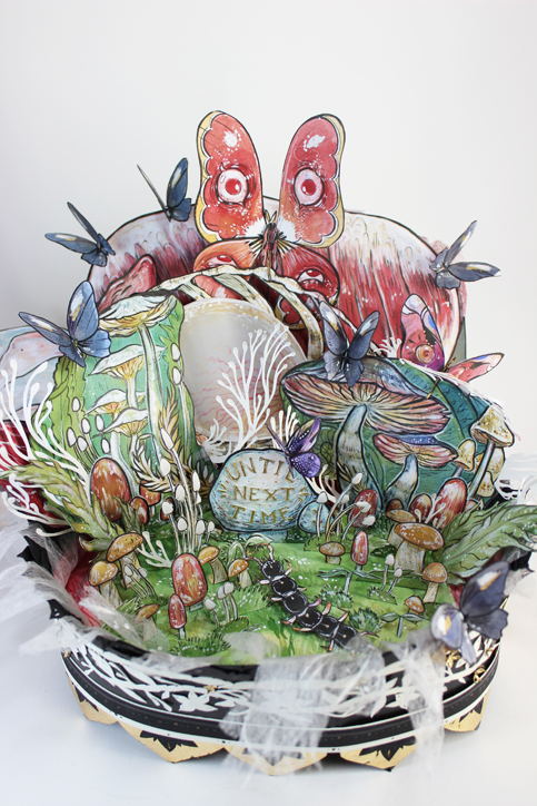
 This piece above is by Alison Woodward and I've always been totally inspired by this kind of style of intricate papercut / pop up stuff. I'm not looking to copy her style, because it's hers obviously but since I have been working with papercut a lot anyway I figured it could be really interesting to just play around more since I'd stressed myself out thinking too much about this project and I just want to have fun and make images at this point. 


This is a test I made, for a scene in the Bloody Chamber, it messed up a bit sizing wise so it had to open the wrong way, which isn't ideal. I incorporated a scrap photo of some meat behind it to make it kind of unsettling. It does kind of get lost in the back there, maybe it should be more prominent? I honestly forget it's there. 

Bit of a cliche colour scheme perhaps??

I want to add more detail to the outside of the iron maiden, so it's kind of embellished and decorative. 

I need to research into pop up books and see the mechanics of making things pop up and out all over the place rather than just opening. 


Monday, 27 March 2017

FMP || info, articles, wall of texts, my notes, reference

https://www2.stetson.edu/library/green/wp-content/uploads/2014/01/prize_2010Formisano.pdf

" Her female protagonists often take on empowered roles where they rise up against oppression and fight for both sexual and political equality. The actions of these women are direct reflections of the feminist movement that took place in the 1970’s"

While it cannot be denied that Carter is most definitely a “glam rock” feminist, using colorful imagery, sensuous prose, and her outrageous imagination to portray her message, the controversial aspect is whether this style is successful. Using her female protagonists to enact her feminist beliefs, critics such as Patricia Dunker and Avis Lewallen, argue that she takes her feminist activism too far in the sense that her stories become too fantastic to serve as an effective tool to promote feminism.

Although classified as “glam rock,” Carter is still a highly effective feminist author because she uses her intense, extravagant style to literally shove feminist ideals into the face of the audience. By doing so, she makes it impossible to ignore her feminist message.

Carter attended the University of Bristol from 1962 to 1965 where she studied psychology, anthropology, science fiction and horror comics (that's a neat selection of things)

'Radical-libertarian feminists stressed that just because a woman’s anatomy deems her female, that does not necessarily means she can only possess the usual characteristics of beauty, ignorance, charm, serenity, and peaceful. They argue that patriarchal society uses rigid gender roles to keep women passive and men active. ' [suggests women don't need to reject 'characteristics associated with femininity, but they can take on 'masculine' characteristics (power etc.) without compromising femininity - characteristics shouldn't be gendered in this day and age but society is still pretty patriarchal soooooo]


'Carter portrays the female heroine as resourceful, clever, and persistent young woman, characteristics that were foreign to women at the time under patriarchal roles, who are able to succeed without any assistance from a male figure'

 In Carter’s re-write, her radical-libertarian message about empowering women is enhanced when the victimization of women is overturned by Blue Beard falling victim to the mother and daughter instead of the other way around, which was usually the scenario because of males supposedly dominant status over women (Makinen 6). As Carter describes in this tale, Blue Beard saw his “dolls,” women, break free from their “strings” and live their lives for themselves (Carter 39). Here, Carter is promoting the radical-libertarian idea that women need to break free from male oppression and become empowered. Only after they are empowered will they be able to live for themselves or live their own life. Carter continues to promote her radical-libertarian beliefs specifically in The Bloody Chamber, where Carter’s female protagonists are pursuing their sexual desires and redefining 8 their sexual identity as well as fighting for sexual equality with men, which was the biggest goal for radical-libertarian feminists during the feminist movement. Carter promotes sexuality by not letting the male sexual desires take dominance. Instead, Carter pays particular attention to reinforce the equality of the sexual transactions between her male and female characters. This equal transaction is seen in “The Tiger’s Bride” between “Beauty” and the tiger. In the scene when Beauty and the tiger go down to the river, the tiger strips naked for her and in return she strips naked for him revealing to him the “fleshly nature of women” (Carter 65). The tiger does not declare that “Beauty” get naked for him and get nothing in return. Instead, by both of them stripping naked, Carter is asserting an equal transaction (Makinen 6). Merja Makinen notes that the beast figure, the lion, is symbolic of a sensuality that women have traditionally been taught harms them (6). When they embrace this sensuality, however, it empowers them and gives them a new strength and awareness regarding their own self and their other, in this case the lion (Makinen 6). Another example of equal transaction between men and women is seen in “The Company of Wolves,” when Little Red Riding Hood tears off the wolf’s clothing and throws them in the fire because his are also gone (Carter 118). From the scene, Carter puts women on an equal plane with men; Little Red Riding Hood returns the feeling of violation that the wolf, man, inflicting upon her (Manning 4). The equality that evolves from the equal sexual transactions between man and woman, as Carter depicts in “The Tiger’s Bride” and “The Company of Wolves” is significant and important in women’s fight for freedom from patriarchal roles and sexual oppression.

Critics like Makinen argue that in “The Tiger’s Bride”, the beast, in this case the tiger, is a direct representation of female sexual desires (7). The beast represents the sexual cravings of women. In “The Tiger’s Bride” when the tiger licks off each successive layer of skin until the woman is transformed into a tiger herself (Carter 67). The protagonist acknowledges and acceptes her autonomous sexual desires (Makinen 6). By accepting her sexual wants, she is making them part of her being, which is seen by her becoming a tiger, a beast, since the beast is symbolic of female sexual desires (6).

I still maintain that Carter’s re-writes do not promote women re-enacting male pornography, but instead women searching for and regaining possession over their libido (Makinen 7).


http://www.independent.co.uk/arts-entertainment/books/features/angela-carter-glam-rock-feminist-6097243.html

[Carter Was] well able to imagine women as flawed and imperfect, 

 [this is good as it doesn't idealise women as sparkling flawless beings as they are often portrayed in the media; a false presentation of women which erases integral parts of existing as a female human. Giving women in media flaws supports the fact that women are in fact multi-faceted people and not personality-less dolls put around for male attention]

Her subject-matter is not outdated. Her take on sex, for example, still has something to offer us. Even as we see a return to the sentimental-domestic ideals of the 1950s, sex saturates western culture as never before. Sex on whose terms? Sexual freedom remains problematic. Freedom on whose terms? Women have been offered the chance to become the makers and users of pornography. Women who decline are labelled prudes. 

[double standards on sex for women, women who have sex are branded as whore's women who don't have sex are prudes. There's a virgin/whore thing going on, where women are either angelic and flawless or absolute satan "games like this claim to have multiple choice but really it's between mother teresa or baby eating, i'm just saying some middle ground would be good"] 

"I've read lots of her books. She was a pioneer who created imagery about female space and female storytelling. She's not just a magical realist. She was female and used magical realism for female purposes. She opened doors for me through which I could walk to enter a new space and own lots of bits and pieces of culture. For example, she took the music hall tradition and delighted in how women could own that and play with it.


Reading these articles have helped me get some more insight into Carter's writing and feminist stance
I had been told that Carter herself did not call herself a feminist, but I cannot find a source for this so far so I don't know. I did read that The Bloody Chamber was not intended as 'feminist' interpretations of fairytales, but creating new tales from the latent content of fairy tales. Anyway I'm a raging feminist and will be exploring the project from a feminist viewpoint!

I'm pretty interested in this term 'Glam Rock Feminism' - it sounds like something I can get behind. 

Friday, 24 March 2017

FMP || Sketches // scribbling

A lot of this is when I was just trying to feel out the stories ; I got really lost and panicked at one point and was just like "what the fuck am I doing with this project".

scribblings:

Bloody Chamber -  disjointed castles. Wanted to give an idea of the depth and darkness going down into the chamber, and the seclusion of the castle being on an island surrounded by sea.

The Tigers Bride - Not sure if it's uncouth but I wanted to make the lead character of Indian origin - cause Tigers are from India - and If I were going to depict characters I wanted to give more diversity and not just draw white women because I kind of feel like I do that alot and should try and be more inclusive.

It was suggested I use reference to make sure the character doesn't have eurocentric features but just the skin turned brown, so thats what I did - using reference images from google.

The bloody chamber again - different angles of the girl - kind of getting an idea of the body shape / reflections in the many mirrors the man has.

Thursday, 23 March 2017

MOnster Girls 20/03/2017

Meant to be a one a week  but I did two cause I'm probably 'behind' in some way shape or form. 


just getting real weird with it to be honest. Found a sketch of a harpy in one of my books and thought that it looked cool, so it became a papercut. 

I'm still really enjoying this because I straight up love drawing all of these weird monsters, and I've been able to develop my practice using cut paper, textures, and working on top of that to add more details. It's something I've really gotten into. 


This one's only half a monster girl so far as I intend to digitally add a tail or something - this is pretty big already and adding any more making it bigger would make it a little extreme.

Loving the textures. 
I make loads of textured pages with brusho and stock pile it specifically for papercut work, think texture is a real driving force in my work!!

Tuesday, 21 March 2017

FMP || THINGS AND STUFF


me & my brain are 400% mixed up at the moment so here is all the things I be thinking. 


FORGET ABOUT PACKAGING DESIGN FOR THE MO. IT'S BARELY IMPORTANT RIGHT NOW. 

I'm going to focus on just making some really nice images based on Angela Carter's  - The Bloody Chamber - to begin with: spot illustrations etc.  and think about the application later on in the game. 

After the tutorial with Patrick I kind of lost my footing with this project as my intention was just to do makeup packaging, but he suggested sanitary product packaging as well - as that would be more obviously linked to Angela Carter's work. 

I liked the idea but kind of realised I have no idea what I'm doing or what I want to be doing hahahhahahaha. 

I thought about all my weird COP stuff and how I'd like to do stuff like that but better, cause the whole weird statement feminist stuff is something I'm really into. I'd like to stick with Angela Carter as a basis but twist the project away from being a commercially driven thing in a way. 

There are things I want to explore, the censorship of women in the media and natural bodily functions and the position of women in advertising - obviously this is still a commercial thing but I just want to explore things and get weird with it. 


edit: talk with ben.

Ben advises to: 
- just base things on Angela Carter, get rid of packaging altogether.
- If I want to get weird with it, just get weird with it
- be self indulgent
- just !! do !! it !!
- research Angela Carter & what stories are best to fit a feminist narrative
- adapt the stories to your own narrative etc
- make a really mixed project
- a publication might be good!!! 
- zines, nice books
- cop magazine format was nice. 
- THINK OF FORMAT
- Le Gun 
- Jan svankmajer Alice

cool, i think i've got some stuff i can work with better here. Simplifying thoughts. focus on making images.

Barely Secret 7 - Warbrain


The second in the series of covers I'm doing. 

This one was more difficult because I had no idea what I was doing, my ideas were a little scattered for this one. I ended up trying more compositions and ideas than in my first cover. 


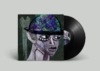
This was one of the first 'final' compositions of this. I asked a friend for feedback as I was not really happy with the image. She said to take off the bones so more emphasis was on the face. I kind of thought that was too empty, but when I did the lyric page I found layering the bones under the lyrics and up onto the cover worked well.


My ideas came from the lyrics: "I can't go on, you said my head's too heavy" and "I can't go on, these limbs have grown too heavy"

I wanted the image to look disjointed as I feel that the song has themes of mental health and the struggle of your head being too bogged down with stuff.

I ended up combining more of the initial sketches than I thought I would.
- using elements of the upside down face 
- exposed / mixed / patterned brain as a hat
- disembodied dangling limbs


I think all this helps to create the feeling of unease and being mixed up mentally. 
I chose to turn the image upside down because it added to this feeling, as well as the fact it just didn't look right the other way. 


The bones on the shape of limbs reminded me of this Alkaline Trio t-shirt design - so the aesthetic matches themes the band already use. 


In the end I think it turned out pretty good, I'm happy with it even though I was unsure about it all the way through making it. 

It's kind of creepy

The video series I think is really working well alongside the finished pieces. `Though it's still hard to condense 3 hours of footage into 3 minutes, but so far I'm managing. 

Thursday, 16 March 2017

Buffy || Digital Experiments

Using the lino prints and drawings I had already done I combines them in photoshop and started playing with colours and compositions - layering things up.

I used an image of Buffy and a stake, and Faith and the knives she is given in season 3 - as one of my main ideas was having the 'big bad' of the season and their main weapon as the cover.

I think the high contrast of the images gives them a dramatic look - matching the tone of the show.

Colours ??? Nothing solid. I kind of like the pinks and purples because it's a bit different and has that 'femme' aesthetic.

Maybe a more feminine / femme/ hard femme/ girl power aesthetic type thing would give this project more direction because then I have more of a target audience and something more to work with. This would be an appropriate aesthetic because (although problematic) the show was a big feminist thing with powerful female roles in the media, etc etc. & I myself like the concept of embracing femininity while not sacrificing strength / equality / etc.

The last image was something I drew up quickly for march 10th which was the 20 year anniversary of the first episode being aired. I'm finding the more shape based stuff does look good, but it's difficult for me to do and I'm unsure whether it's kind of sacrificing my style of drawing but I am just struggling a lot with adapting the characters into my style at all????

Wednesday, 15 March 2017

A Card From Angela Carter


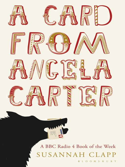
I've been reading a bit of this book to research more into Angela Carter herself rather than just her work. It documents postcards that Susannah Clapp recieved from Carter, as well as her memories of Angela.

A point that stuck out to me was that Carter was glamorous, fashionable and enjoyed clothing etc. (Though it may not have seemed so as she dressed more comfortably after having a child).

Though I have re-considered focusing my project around makeup packaging I think this fact would make the application of the images to something like that, or a fabric, or items of clothing would be appropriate as it would reflect Carters glamorous side and personal interests as well as the subjects of her stories.

Friday, 10 March 2017

CMV & EP

When I was talking with people at CMV I realised that I'm not looking at doing my work on the course in the right way.

I'm getting too bogged down thinking of things in terms of products I'm forgetting to focus on making great images around a theme that I really love, as the big projects - Buffy & FMP are ones that I should be really invested in dedicating time to but I keep thinking about 'oh my god, this won't do for this product etc etc' when the reality of it is I should just focus on making some great artwork and then I can apply that work to products I have in mind.

I'm hoping this realisation will help me to get back into my work, making some really fabulous pieces rather than just a ream of sketches that I'm unhappy with.

Thursday, 9 March 2017

BUFFY || LINO


To try and get out of the slump of drawing the characters over and over I did some lino prints of weapons, which was really fun! I love the shape based stuff and I'm excited to try different things with these bits and pieces. 

I think lino is a really good indicator of my style as it allows use of shape and texture. I'm a very mixed media person so I want to try different compositions of bits and pieces - combining these with drawings of characters I've already done. 

There are a couple of lino prints I still need to do on a bigger piece of lino (the scythe and some swords) 

This rejuvenated my interest in this brief and lessened my suffering and feeling like a horrible failure not able to do anything good!!!

Wednesday, 8 March 2017

V for Vendetta FIlm Soc


Screenshots of the whole process of putting this whole thing together. 

V for Vendetta is one of my favourite films so when the film society were putting it on i couldn't nod do a poster for it!!

I drew out the mask and made the roses from cut paper, all seperate and brought them into photoshop to play with the composition. I find this works for me and my practice as it gives me more freedom to play with bits and pieces, chop and change, get rid of things that aren't needed, add more bits, I just have more fun, especially as adding stuff wont ruin the image as I can always take it off if it looks bad. 

For me adding that last bit of texture in the end is what really makes the image for me, as I feel that adds a bit of character and pulls the whole tone of the picture together!!


Period Panties


Along with reusable sanitary pads, these specially designed 'period panties' are also a thing that's propular among the youth. The concept lends itself to illustrative designs and I believe some of my work may be appropriate to be applied to something of this nature.

Monster Girl - Werewolf.


This was a little weird to draw because I didn't want to oversexualise the werewolf but I like drawing boobs. 
It's pretty messy but I kind of dig it. The texture on the fur parts pleases me greatly. 

I need to start rubbing out my pencil lines before I scan things. 

I don't know how faces work. 

I think that this is successful in the terms of combining papercut techniques with painting  to add details, which has made the monster girl more successful than the centaur.

To make it more of a 'complete' image I started to lay out a background but was kind of struggling with it, and ended up putting it to the side while working on other projects with the intent of coming back tot this. 


Saturday, 4 March 2017

Barely secret 7 - Haunting Haunted Haunts

Since there's no secret 7 this year and I really wanted to do something musically based, I decided to do a similar thing but just with songs of my choosing.

This is the first one I've done for Against Me!'s Haunting Haunted Haunts.


Most inspiration for this came from the lyrics of the first verse "tonight I cant sleep because I'm haunted, so I'm breaking spells of intention, all I can see is the space inbetween, the space where you're missing" 

I just got a really witchy vibe from it, and as it's called 'haunting haunted haunts' I wanted to include a haunted house. 

The colour palette: purples are kind of mystical, I didn't want this to be too overpowering so stuck with limited palette, varying shades of pink / purples / greys / black

The original art for the album this is on is pink and black too so I thought using similar colours would hark back to that influence. 


I also mocked up a potential lyric insert, I think I would have to print it out to see if it would actually work (and I may very well do that) It sure is a LONG image though. 

Since the band is a punk rock band I thought my scrawly disjointed handwriting worked for the tone of the song. 


I love the different colours the text has gone over the top of the textured background, it's exactly what I imagined when I decided I was going to do a lyric sheet. 

My work if pretty rough around the edges but I don't think that's necessarily a bad thing, it's part of my personal style and I think this punk rock / textured kind of thing really lends itself to that style. 

I think there is still room for improvement because when is there not 

I decided as part of this project I would film it and make videos going along to the song it's for, so ya can see the art being made alongside the bangin tunes. 

I learned how to record my screen - which is useful, and I also learned 2-3 hours of footage is a bit of a struggle to condense into 2-3 minutes


I really love how the video turned out though I think next time I will focus in on the photoshop screen so that my other computer things going on aren't in shot, and also a clean desk space would be more presentable (but I am a messy person so is that truly going to happen?)

Looking forward to turning this into a series!!


I'm really finding combining media great fun as I can stockpile lots of components and mash them together as well as getting different effects from layer modes and opacity's that I wouldn't get traditionally!

 I struggled to draw hands for this so I ended up using some monoprints from my FMP which fit in really well. I feel like I can do a lot of experimental printing and collage and just build up a back catalogue of things that I could use in future work.

SI // Buffy // FAce Shapes // themes & notes to self

This post is mainly just brain mush so I can organise my thoughts not in a sketchbook


I fiddled with some images in photoshop, threshold and posterise to bring out the shapes so I can focus more on blocks of shape & colour instead of struggling trying to draw faces from photographs.

It's tempting to screenprint some thesholded photographs as collage fodder


maybe just weapons or something easier to portray

http://buffy.wikia.com/wiki/Category:Weapons

imagery by season? something for main themes or plot lines?

1: beginning // slayer // prophecy
2: love // loss of inoccence // angel turns bad
3: faith // mayor // maturing
4: uni // the initiative // riley // Adam
5: glory // key // change
6: ressurrection // willow // magic //  power // addiction // depression // wow everything is just going wrong // barely a happy ending tbh
7: potential // slayers // strength // chosen // bringers // end