Type - Light - Illuminate.
Inspired by motel signs and neon lights. I would need to research the makeup of neon signs as this looks just like two colours of text, some more detail could be added. The colours really give the the impression of a neon sign though.
Image - Illuminate
The sketch is portrait but would be landscape. I love the gloomy atmosphere of this image, it has something intriguing about it - like there's an underlying story. The grey scale brings the eye to the coloured lights in the image.
Type - Illuminate
I struggled to make the writing look like a city, there could be more buildings added but this could obscure the actual type.
Image - To Light
Done a little experimentation with collage here. This image has the potential to have some kind of narrative like the Motel image. The suggestion of a winter evening is not so strong in the rough but that is the feeling I want to convey. The background would be dark and but with snow. It is really influenced by The Muppets Christmas Carol, as well as the quick approach of the cold winter months at the moment. I am feeling festive. I think the image could end up looking like a Christmas card, I am unsure whether this is a good or a bad thing. Maybe the scenery would detract from the light?
Image and Text - To Light.
Like the initial idea of the incence this has potential for words in the smoke. I was unsure what to write at this point so I just added 'Light Up' to get the idea of text across, though this is not very creative. The concept is interesting and could match the tone of the Motel image , but it definitely needs development.
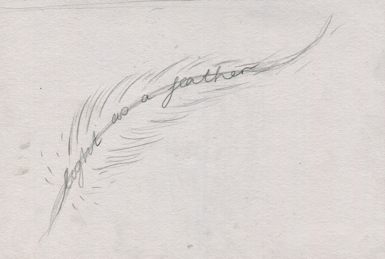
Image and Text - Lightweight
I wonder whether this image is too obvious. There are much more interesting concepts I have drawn up. I find this image a bit too twee and simple. Perhaps it could be developed in some way.
Feedback
None of the imagery is confusing, all of them show 'light' clearly. Some of the imagery such as the feather (above) and the match (not pictured) are obvious but they liked the feather anyway as it clearly showed something lightweight.A lot of my roughs were fairly sketchy and it would have been nice to see some more experimentation with media and colour. I did use some different media but not an extensive range, so it would be good to experiment more with media to find the most appropriate ones for my images.
I was drawn to the cigarette image to develop, Char said that she remembered my editorial pieces and that this image would be busy looking and that would suit my style.
Self Evaluation
I have struggled with the type element of the brief but I have been trying to experiment with it. Drawing out my initial ideas worked a lot better on this brief than in previous brief's as once I had found three definitions of the word drawing was the only way to go. Having those ideas ready on the page made it a lot easier to get my roughs out. I think I could have gone a lot further with my ideas and expanded on some, such as Light made of lamps. Maybe in some images I played it safe and could have pushed the limits but at the same time that may have become confusing. The meaning could have gotten lost in translation and been really time consuming - but I should have tried regardless to test it.
The ideas that I intend to develop are the motel and the cigarette images. I love the dark tone of the images which could really bring out the light element of the images. They match each other too, and could maybe be turned into some kind of narrative. I honestly do not like any of my type image so I am going to have to develop these further. It's going to have to relate to lightweight as the two other images I have chosen to develop relate to the other two meanings.
To develop these pieces I'm going to have to think and experiment with media. I did start to do collage but it was suggested that for the tone of my images that inks or watercolour would be better. Research will be a big part of development too, particularly drawing from reference so poses, scenery and tone will be correct. What paper to work on is something on my mind as to take ink and watercolour I will have to use specific paper!


No comments:
Post a Comment